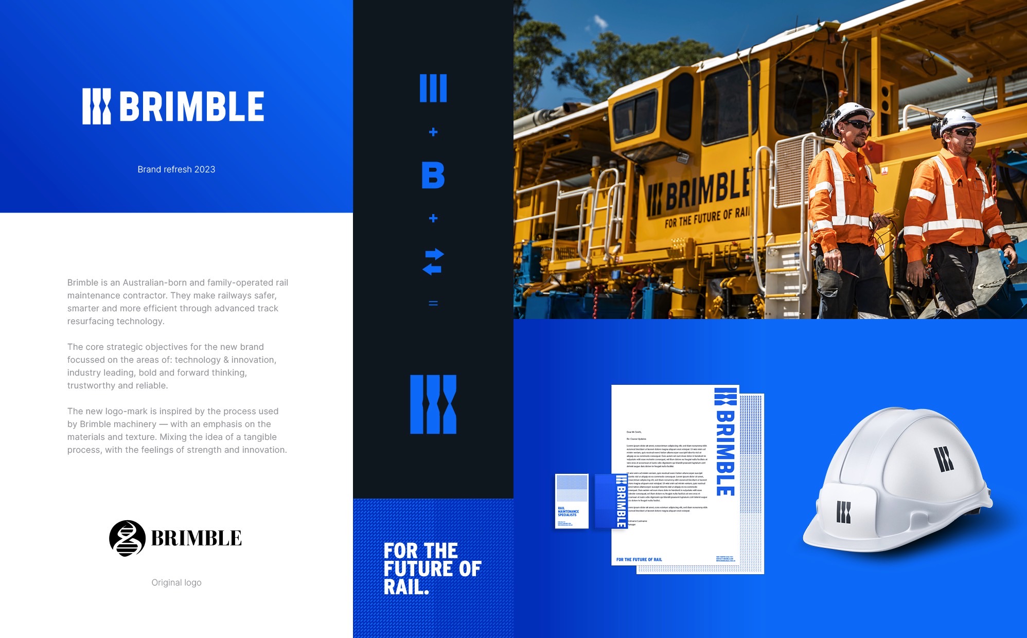
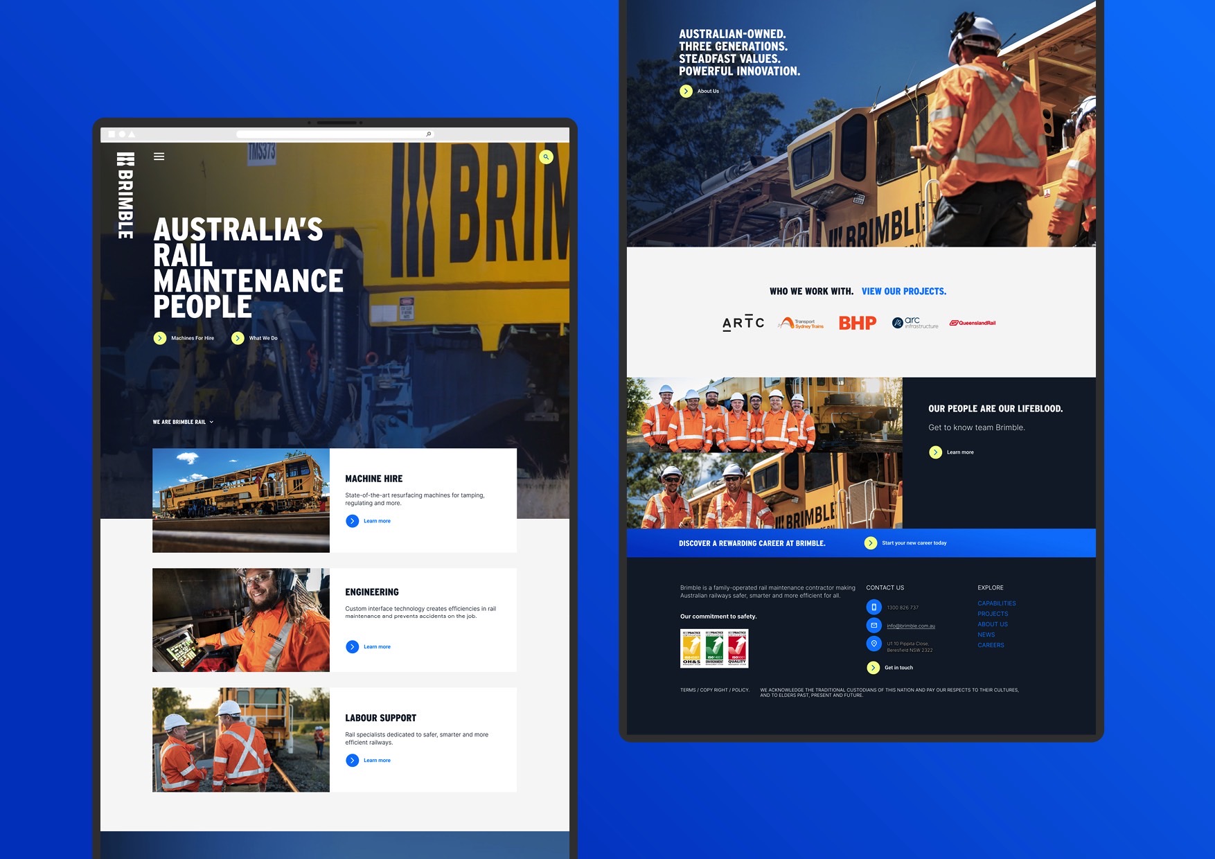
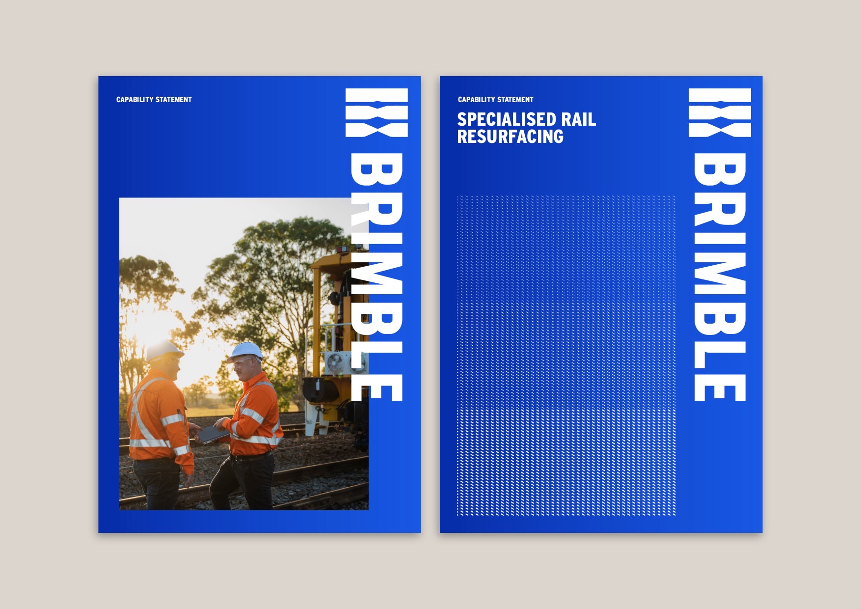
Brimble is a family owned rail maintenance contractor from the Hunter Valley making a name for itself among industry giants. With three generations in rail, the brand needed to communicate its strong legacy and focus on homegrown innovation.
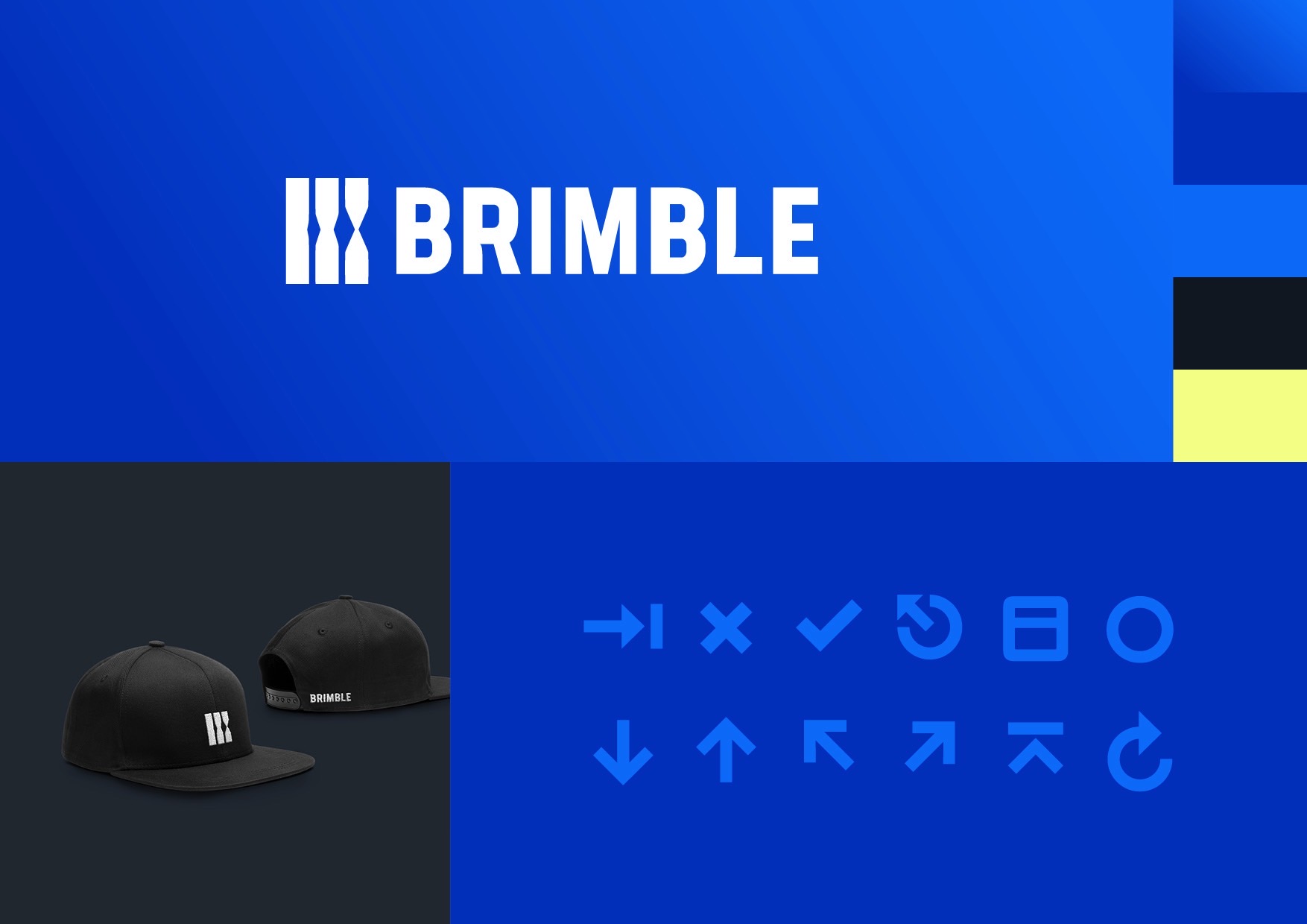
The brand refresh sought to modernise the visual identity, elevating it to compete against larger players. Inspired by the track resurfacing process, we looked at materials & textures, blending the idea of tangible process with strength, trust and innovation. The icon takes the idea of rail tracks, 3 generations of rail for Brimble and the 3 main railway gauges in Australia that they service. This along with the “B” and an arrow concept representing the process of rail alignment create a solid, bold & trustworthy mark that truly represents and elevates Brimble. A strong black & white core palette, with the introduction of a vibrant ‘Aussie true blue’ – adds approachability and differentiation.
