


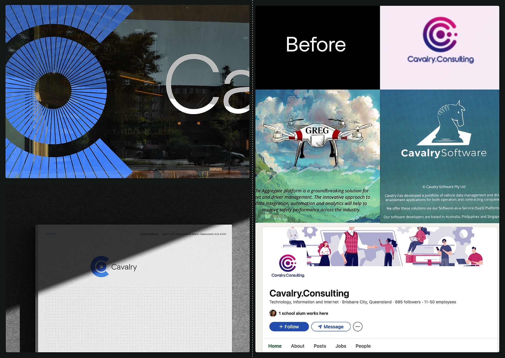
The central idea of ‘assembling the cavalry’ informed both the visual and verbal brand. The reimagined visual identity is centred on Cavalry’s core purpose: entering businesses that are under strain, have broken systems and outdated processes, and helping them unlock operational and financial potential. This idea is expressed visually through the unified “C” symbol, which forms the structural basis of the identity. Around it, a modular brand system was developed to house each of Cavalry’s divisions — Consulting, Software, Engineering, and Software Products, within a cohesive and flexible framework. The design reflects a transition from complexity to clarity, capturing Cavalry’s ability to drive progress through structure and momentum. The system balances professionalism with creative confidence. It is bold and institutional enough for government-facing work, yet expressive and modern enough for the tech and innovation landscape. This versatility allows Cavalry to move seamlessly between sectors, reflecting the breadth and depth of expertise.

Cavalry

