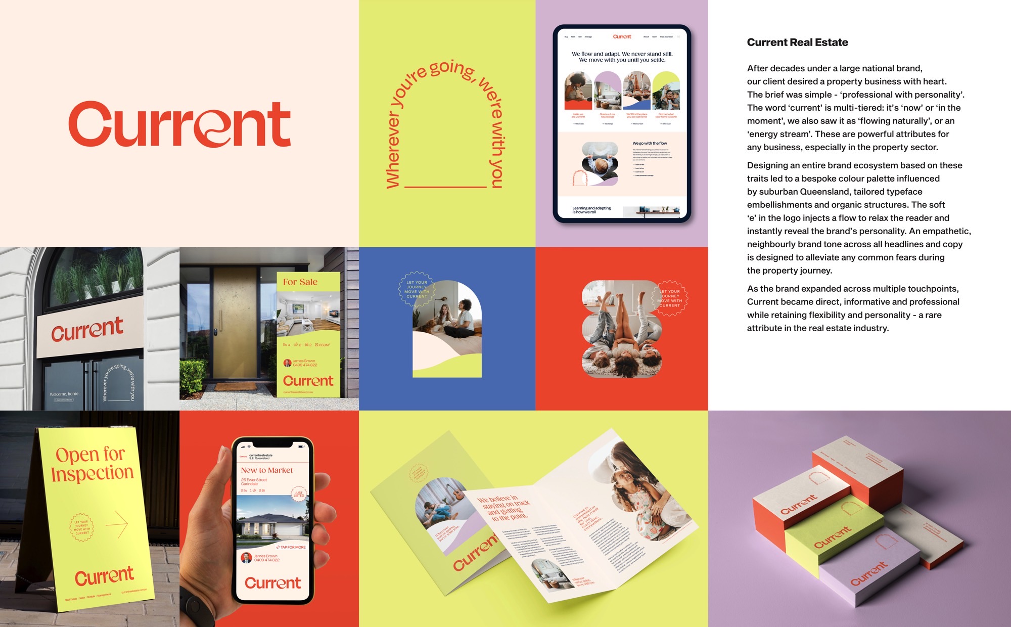
After decades under a large national brand,
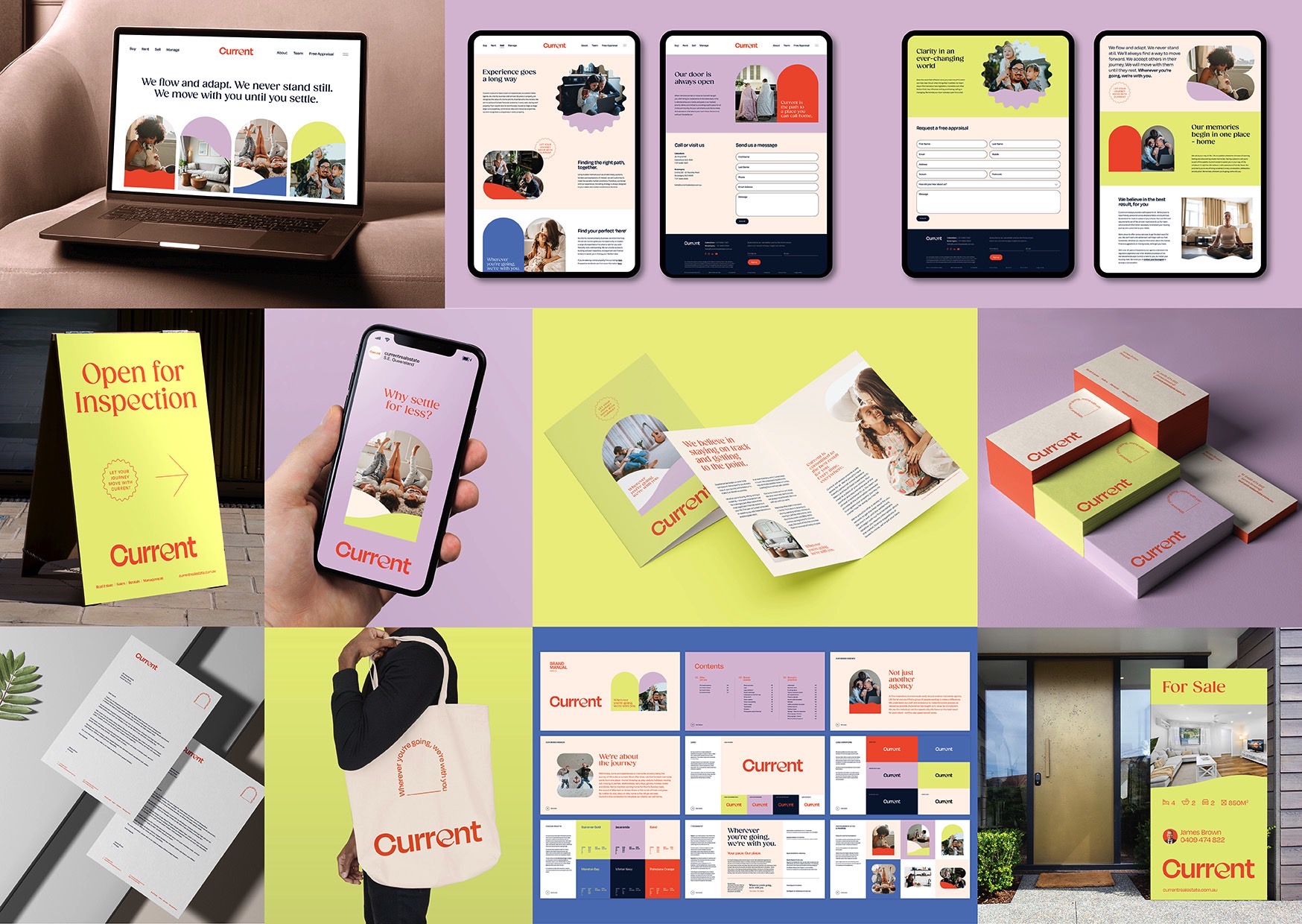
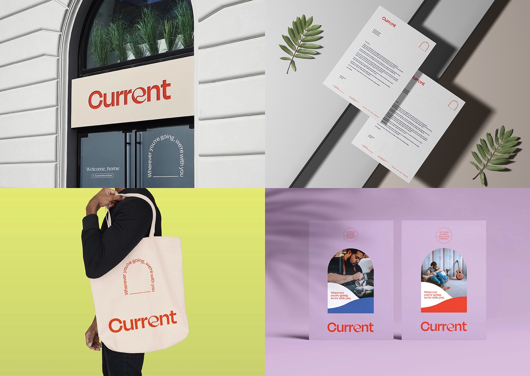
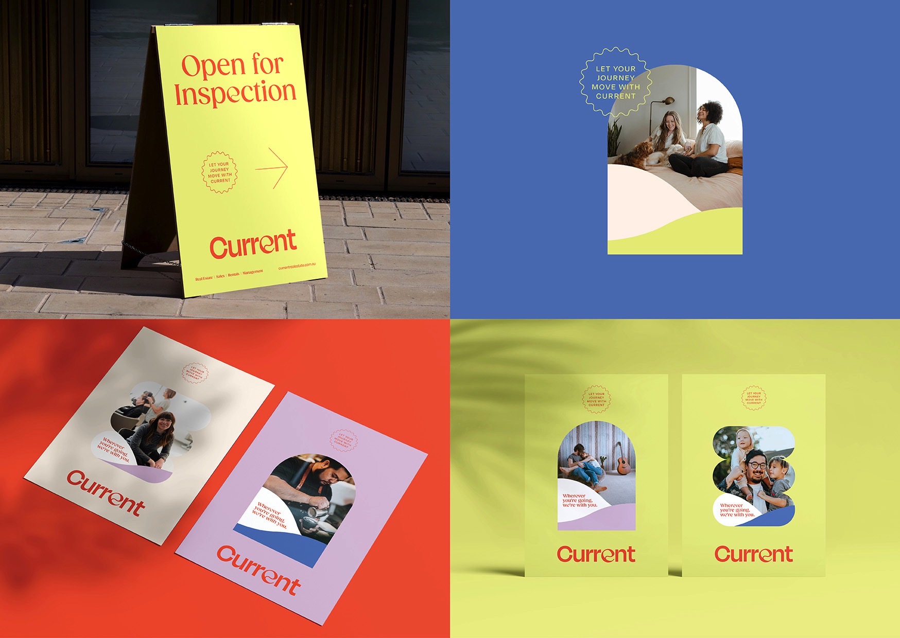
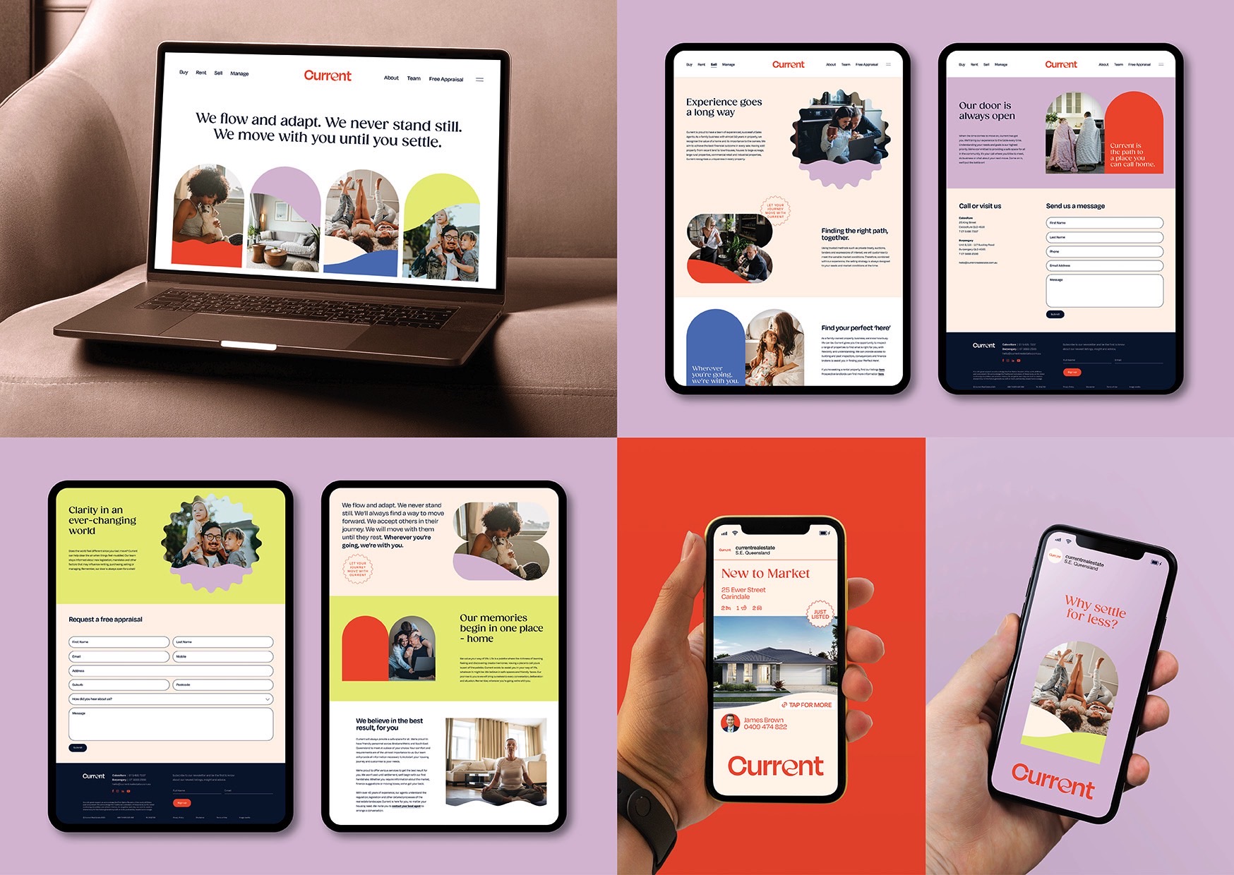
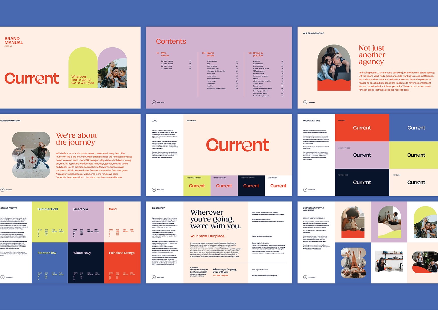
our client desired a property business with heart. The brief was simple – ‘professional with personality’. The word ‘current’ is multi-tiered: it’s ‘now’ or ‘in the moment’, we also saw it as ‘flowing naturally’, or an ‘energy stream’. These are powerful attributes for any business, especially in the property sector.
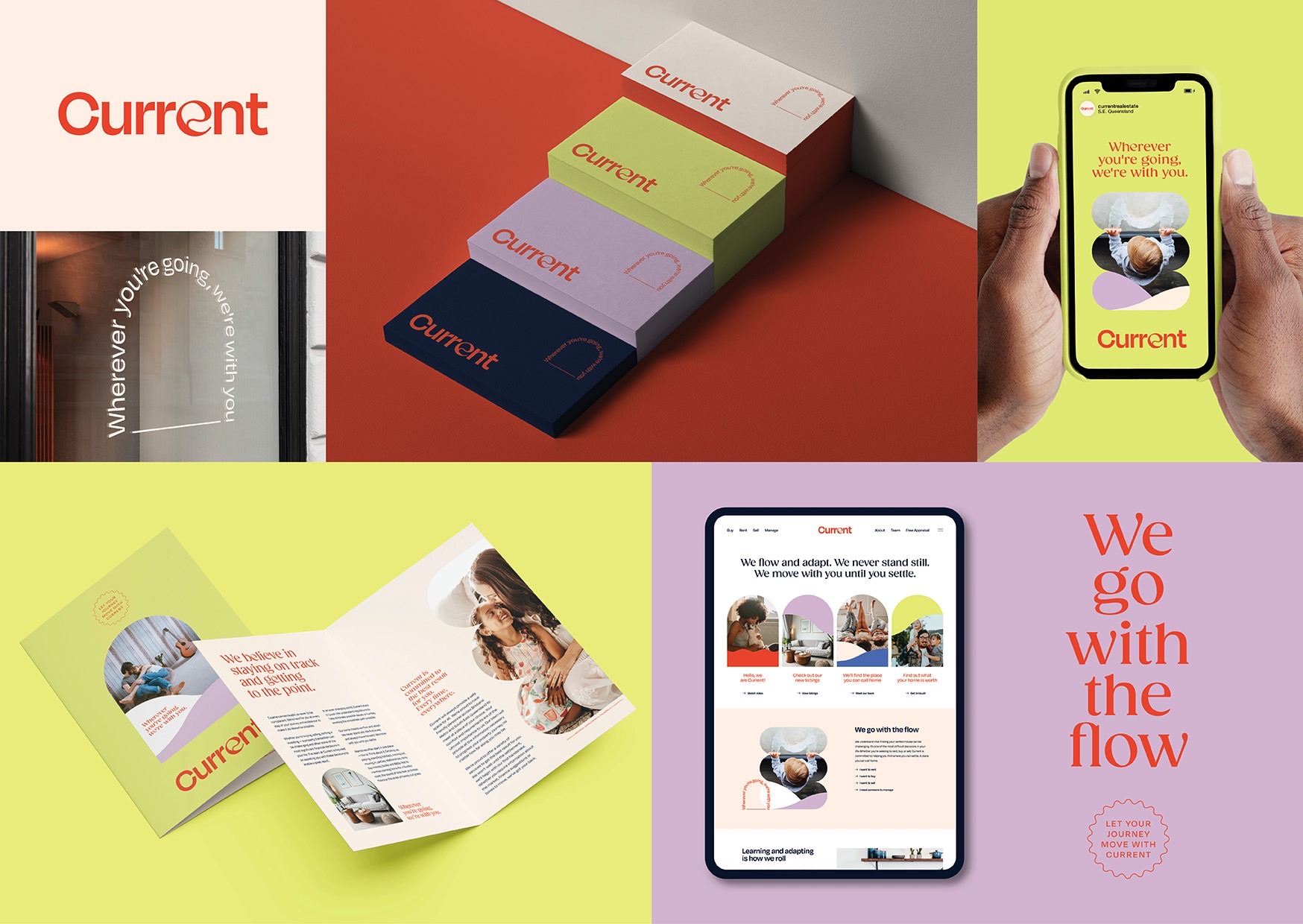
Designing an entire brand ecosystem based on these traits led to a bespoke colour palette influenced by suburban Queensland, tailored typeface embellishments and organic structures. The soft ‘e’ in the logo injects a flow to relax the reader and instantly reveal the brand’s personality. An empathetic, neighbourly brand tone across all headlines and copy is designed to alleviate any common fears during the property journey.
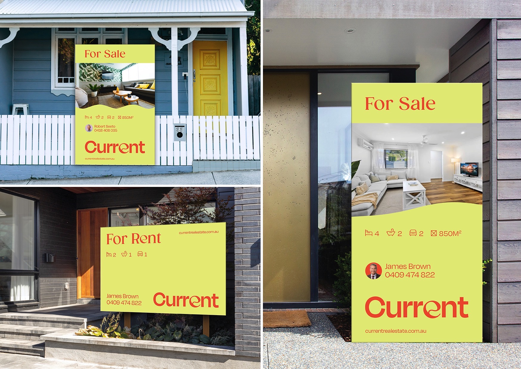
As the brand expanded across multiple touchpoints, Current became direct, informative and professional while retaining flexibility and personality – a rare attribute in the real estate industry.
