With stores across Queensland and New South Wales , Flannerys are one of Australia’s leading natural, organic and wholefood stores, providing healthy alternatives for over 30 years.
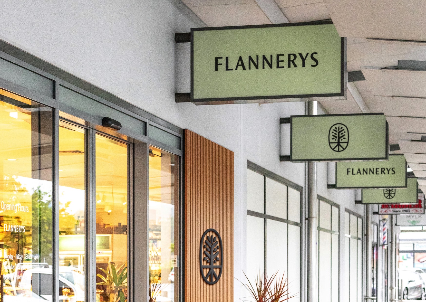
Flannerys required an updated brand identity to better align with their organic roots and community values. Looking to attract a younger demographic without alienating their existing customers, Flannerys were keen to strip away their ‘corporate’ appearance and reconnect with the neighbourhoods they serve.
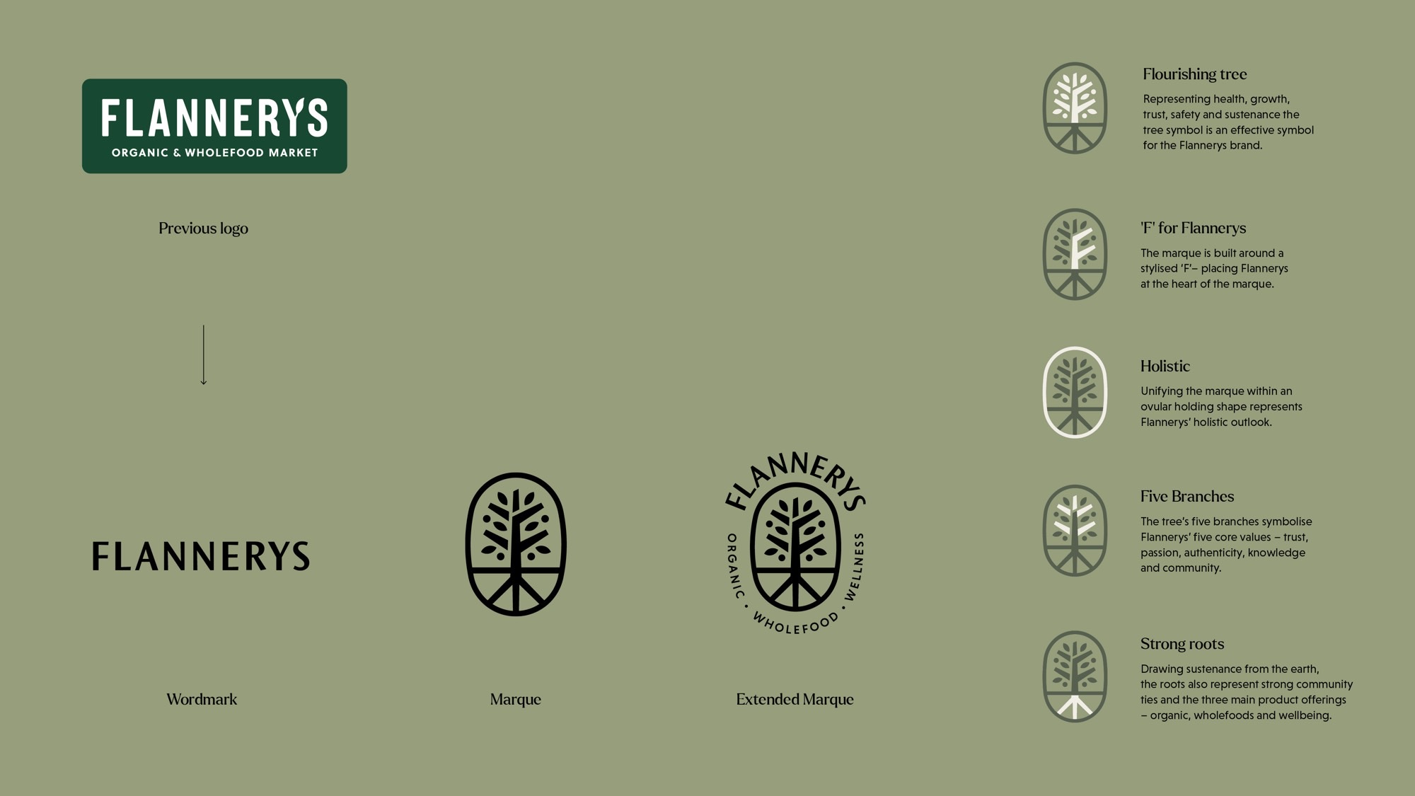
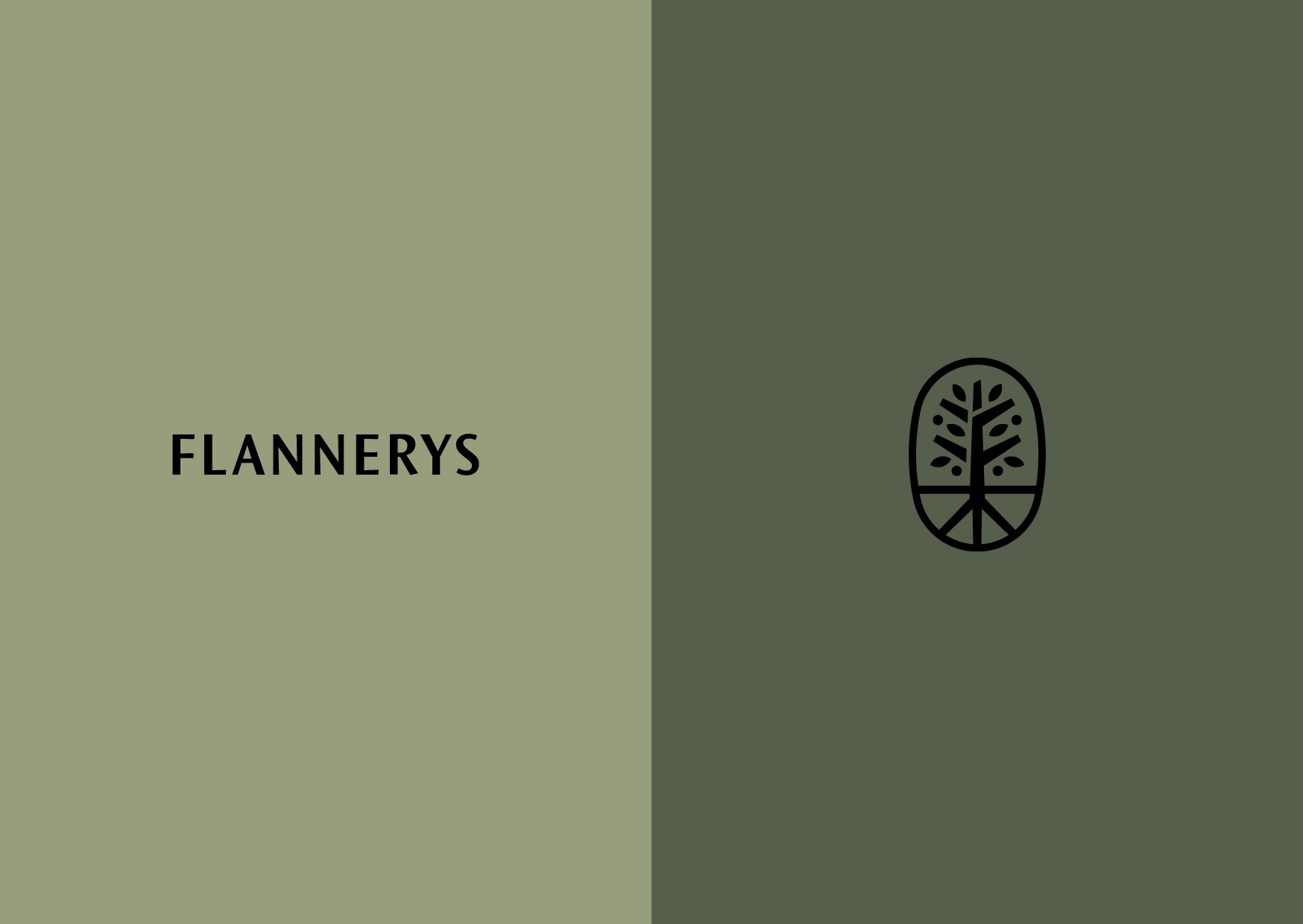
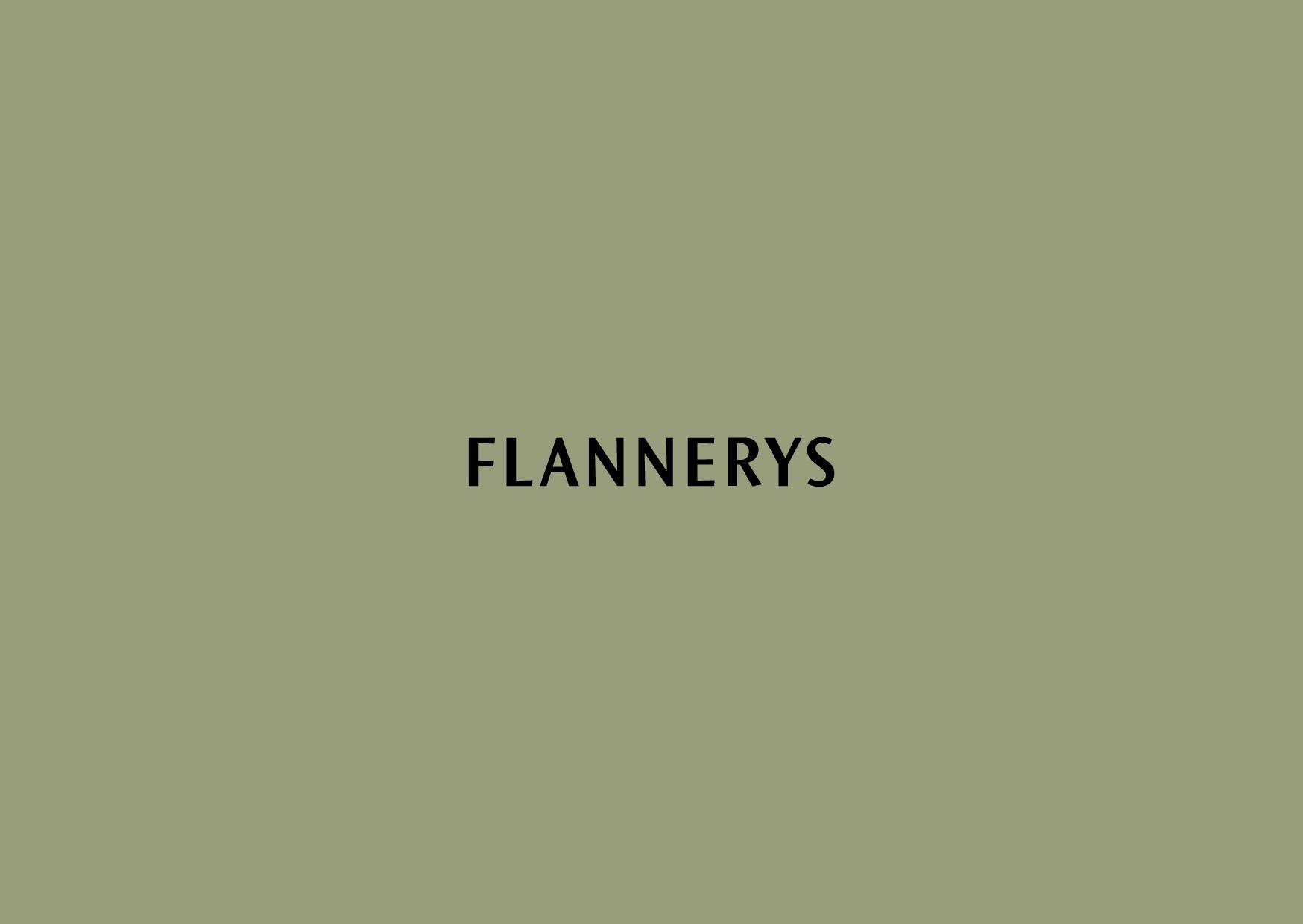
Featuring quirky details and irregular angles, the contemporary ’imperfect’ wordmark demonstrates the organic, wholesome and authentic nature of Flannerys.
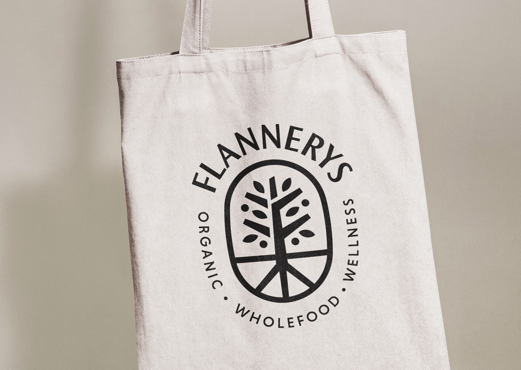
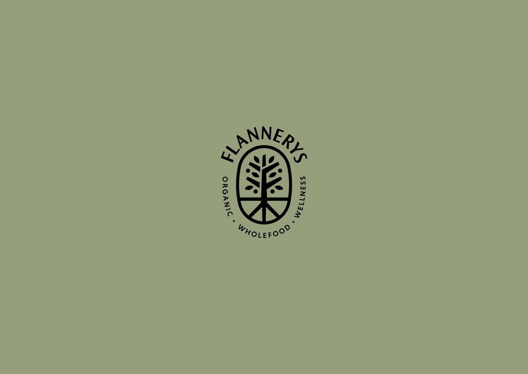
Natural, organic and drawing from the earth (whilst representing growth, trust, safety and sustenance), the marque was formed around the concept of a flourishing tree. Featuring an ’F’ at its heart, Flannerys’ core values (trust, passion, authenticity, knowledge and community) are represented through the five branches. Strong roots symbolise natural sustenance, community ties and the three main product offerings (organic, wholefoods, wellbeing).
