


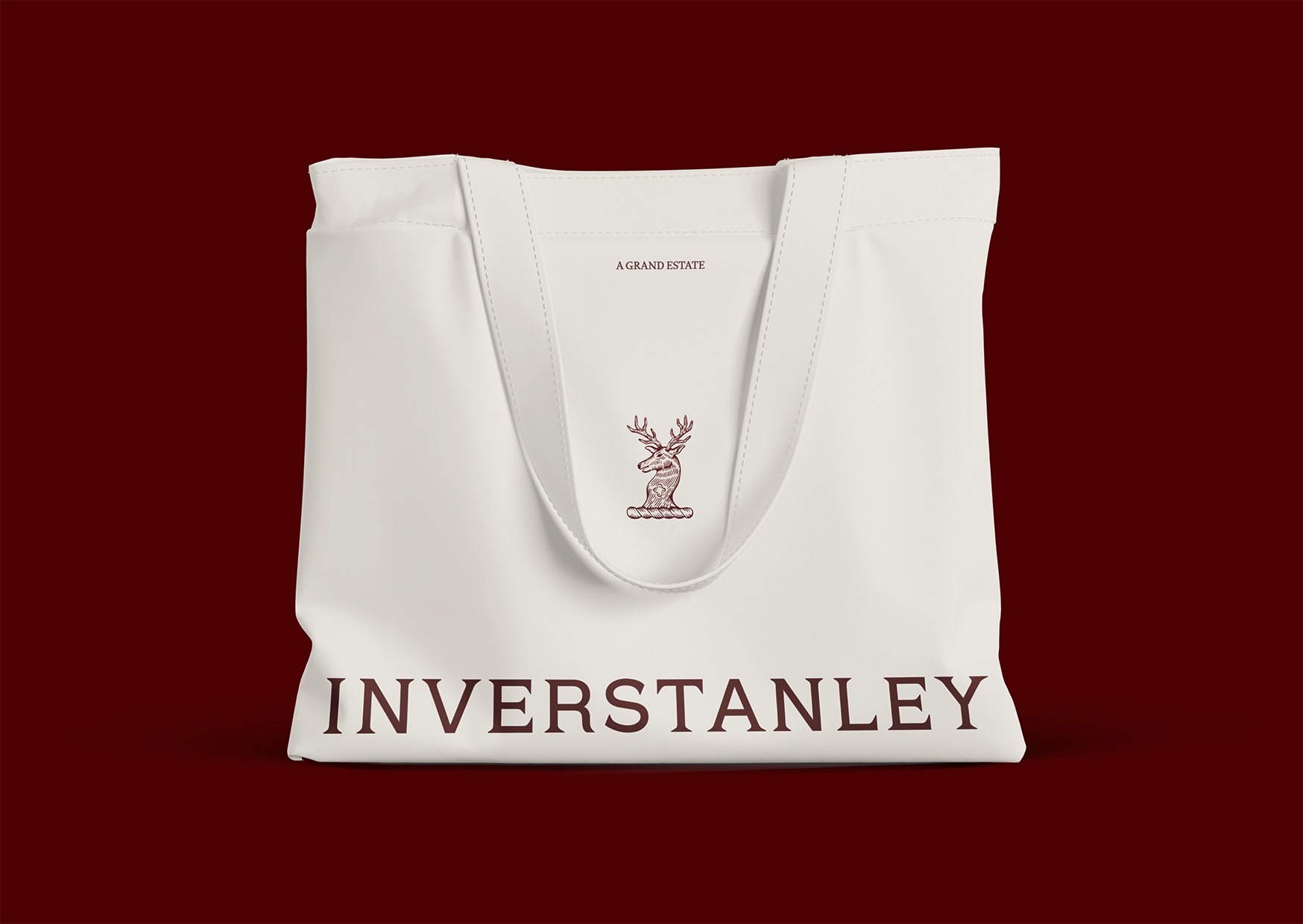
Inverstanley needed a logo that embodied its rich family heritage, and elevated rural charm. It had to communicate both prestige and sincerity—anchored in history, but ready for a new chapter. We drew inspiration from the McConnel family’s original crest and the refined grandeur of traditional estate branding. The idea was to create a mark that could carry the story of Inverstanley with dignity, heritage, and warmth—without feeling dated or decorative. The logo pairs an all-caps serif wordmark—generously kerned for elegance and air—with a custom, hand-drawn crest. The crest retains traditional elements from the McConnel insignia while introducing simplified, contemporary detailing to suit modern applications. The result is a logo system that feels grounded yet aspirational, designed to endure for generations to come.
Inverstanley Brand Identity

