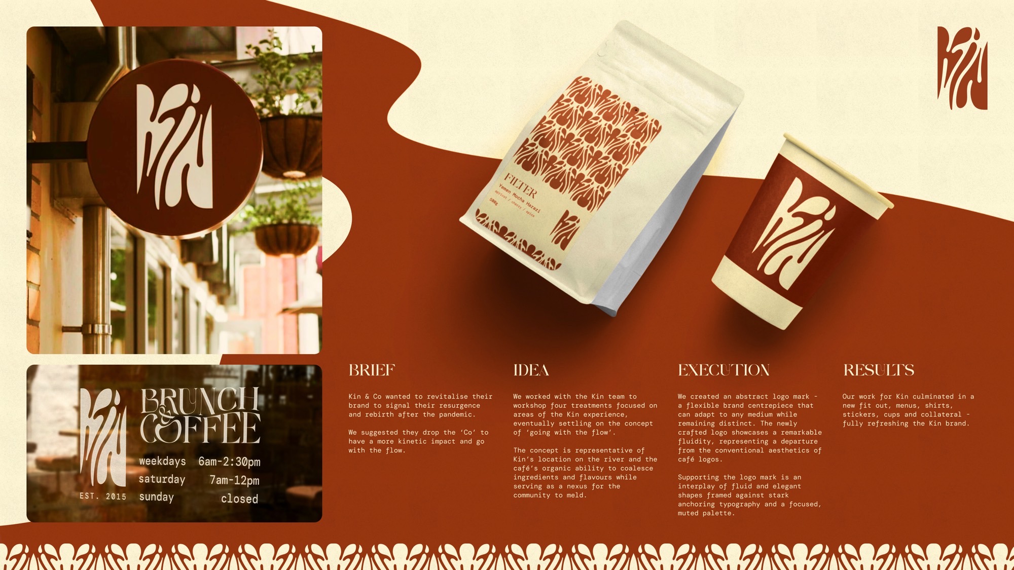
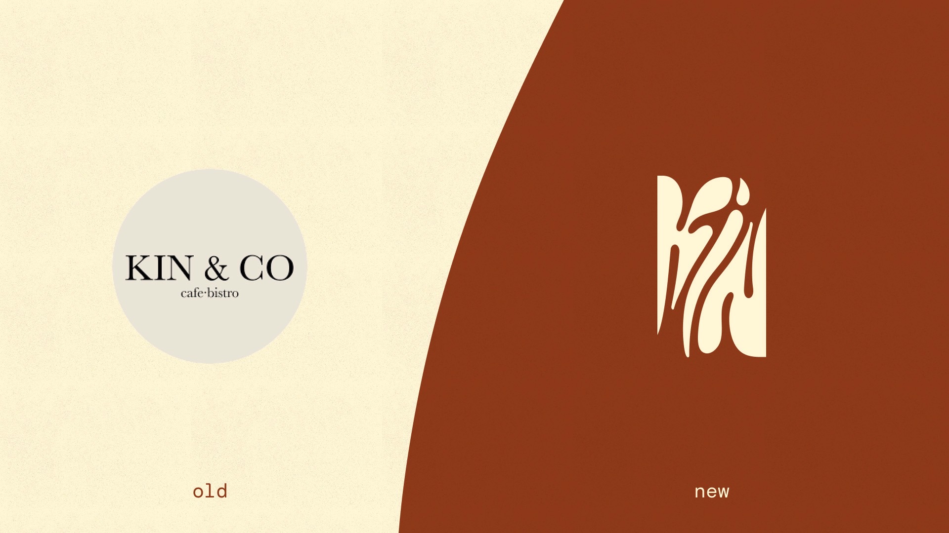
Kin & Co café wanted to revitalise their brand to signal their resurgence and rebirth after the pandemic.
We suggested they drop the ‘Co’ and go with the flow.
We worked with the Kin team to workshop treatments focused on areas of the Kin experience, eventually rallying on the concept of ‘going with the flow’.
The concept is representative of Kin’s location on the river and the café’s organic ability to coalesce ingredients and flavours while serving as a nexus for the community to meld.
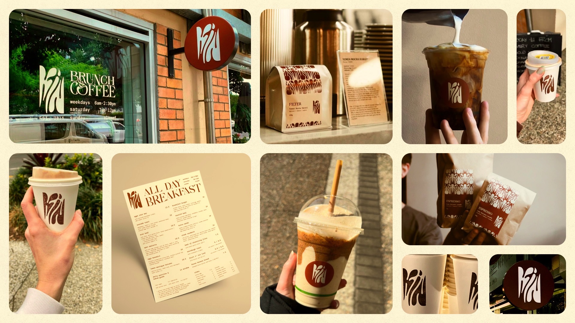
We created an abstract logo mark – a flexible brand centrepiece that can adapt to any medium while remaining distinct. The newly crafted logo showcases a remarkable fluidity, supported by elegant shapes framed against stark anchoring typography and a focused, muted palette.
Our work for Kin culminated in a new fit out, menus, shirts, coffee cups and online & print collateral – fully refreshing the brand.
