



Jim McKeering Real Estate had been a trusted name in the 4017 postcode for over 70 years, but with the rise of digital-first competitors and shifting consumer behaviours, the brand risked losing relevance. The brief was to modernise the identity while retaining its legacy and community trust. The solution was a confident rebrand: a name refresh to simply “McKeering”, paired with the line “Your Forever Agent” to reflect lasting relationships over transactions. A bold yet approachable wordmark, a refined colour system tailored to property categories, and warm, personable messaging brought distinction to a traditionally cold category. The visual identity extended across signage, collateral, and stamps, creating a tactile, memorable brand system. Soft, nostalgic tones and human-centred design bridged heritage and modernity, helping McKeering stand out as both a market leader and a familiar face. A local agent with heart and a brand to match.

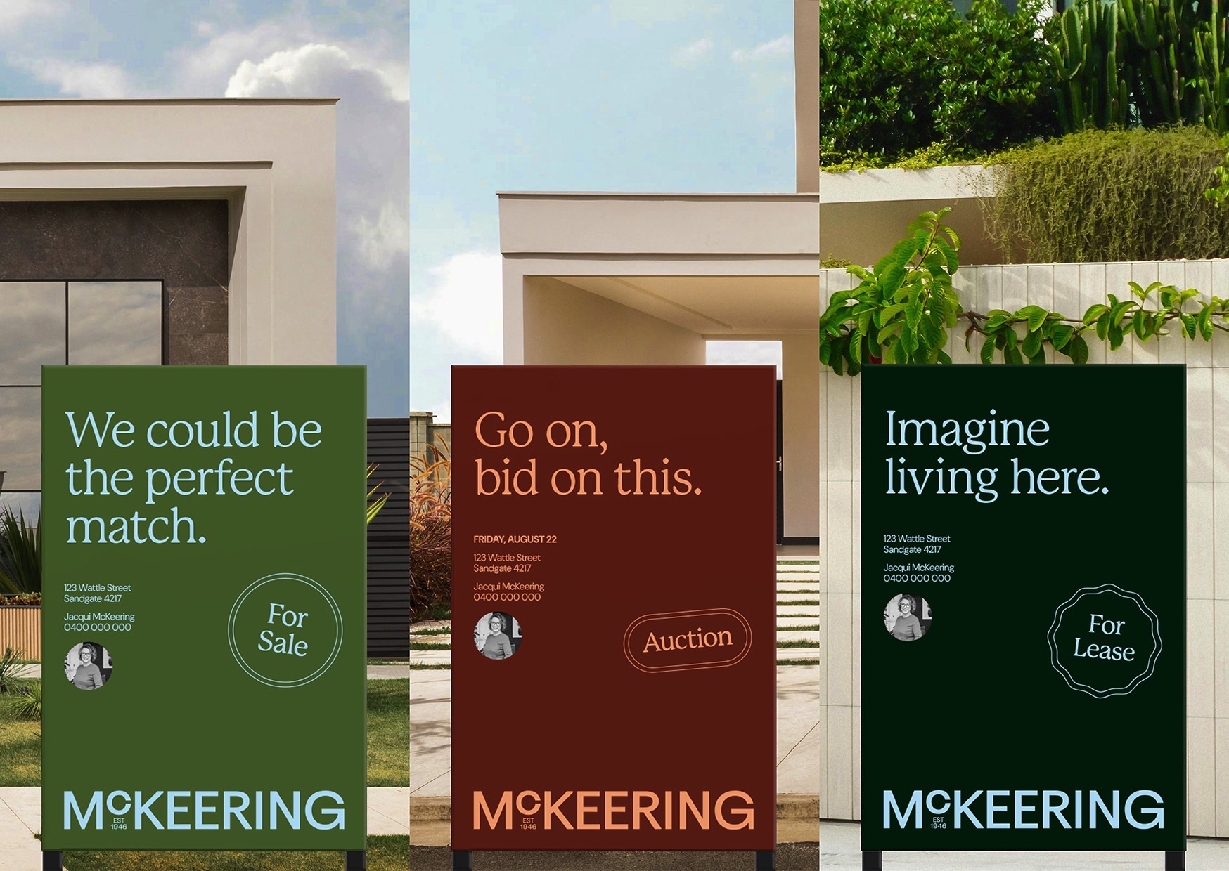
McKeering Real Estate – “Your forever agent”

