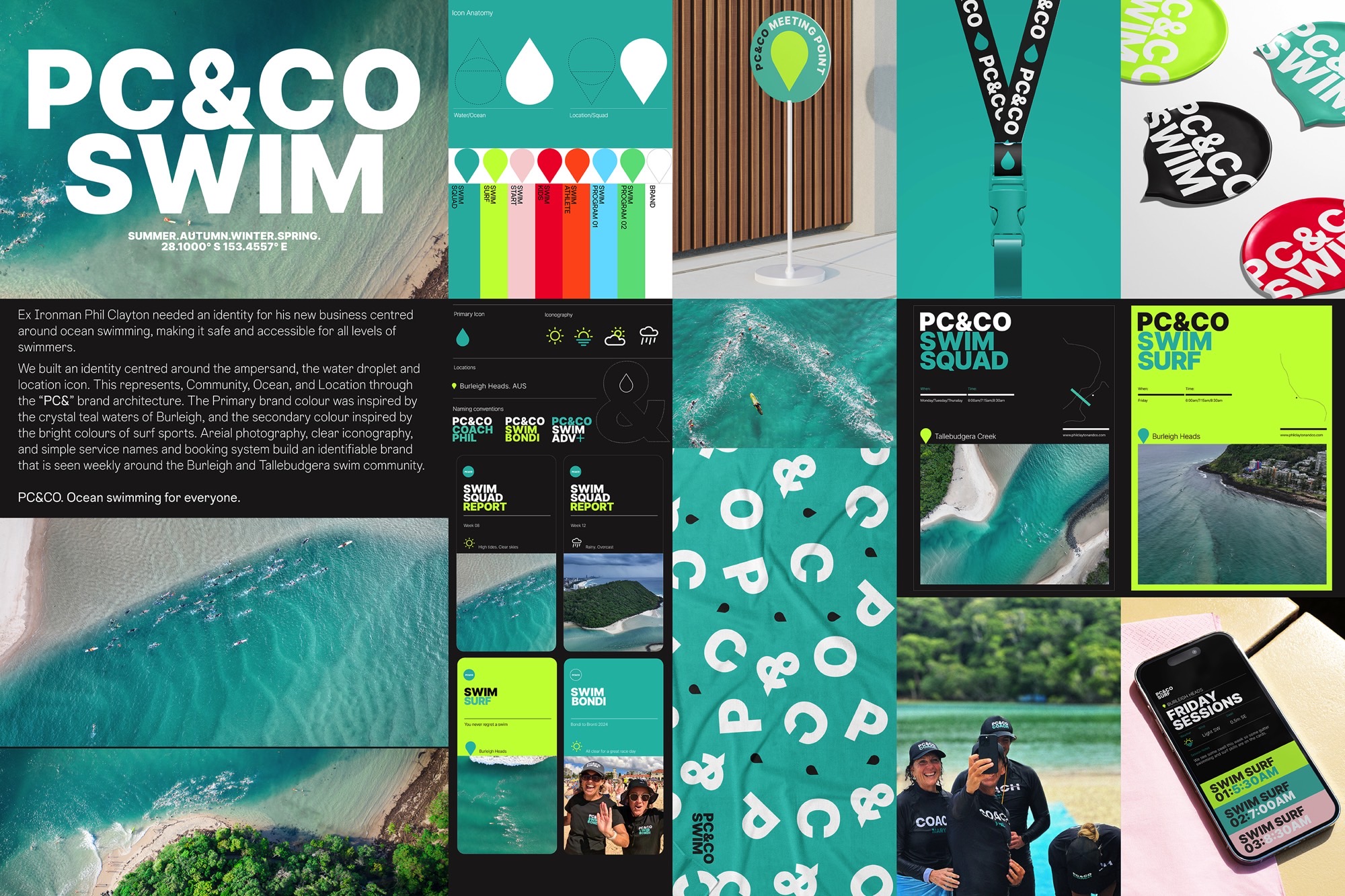
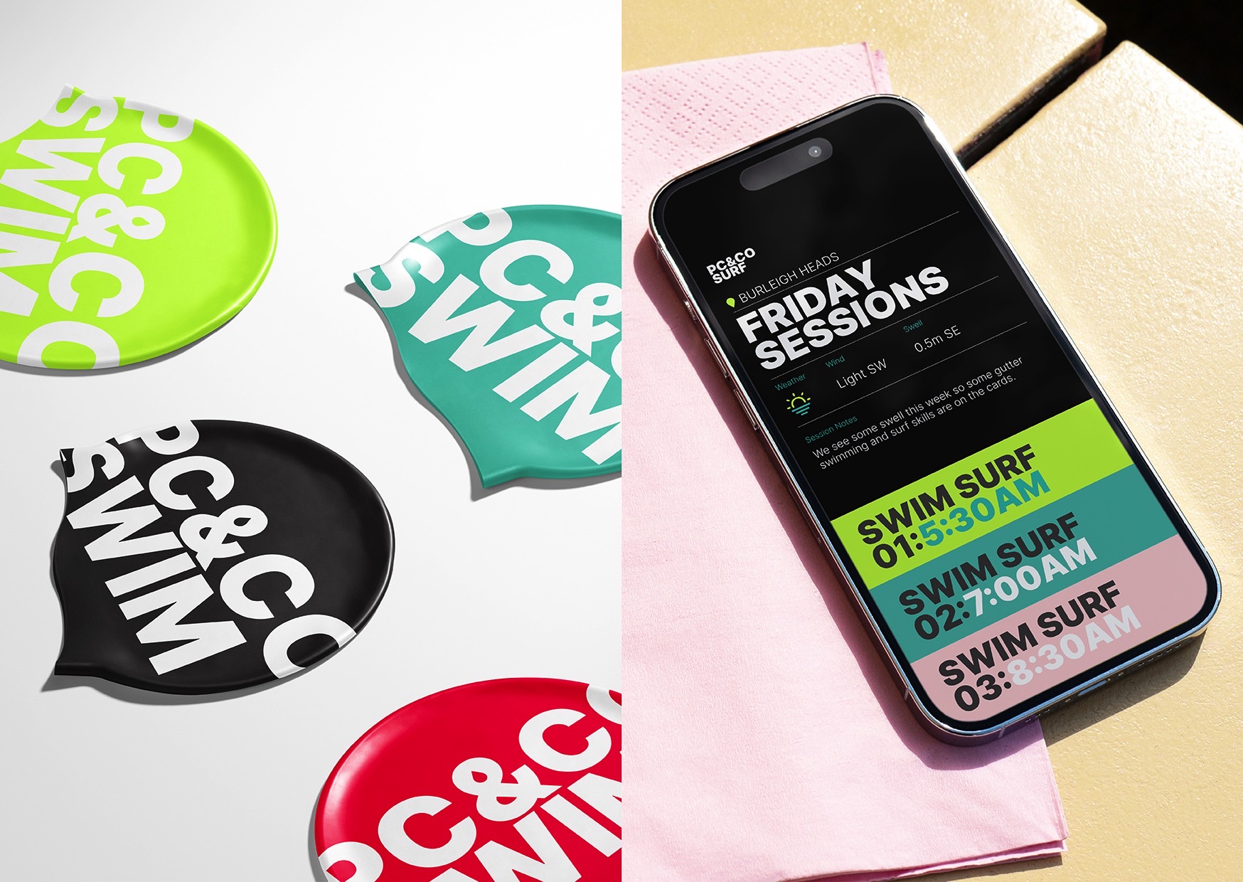
Ex Ironman Phil Clayton needed an identity for his new business centred around ocean swimming, making it safe and accessible for all levels of swimmers.
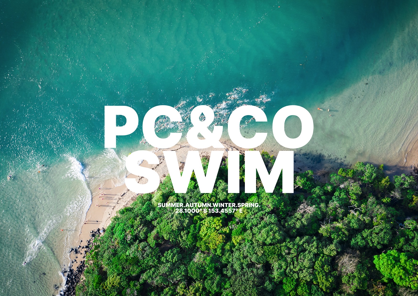
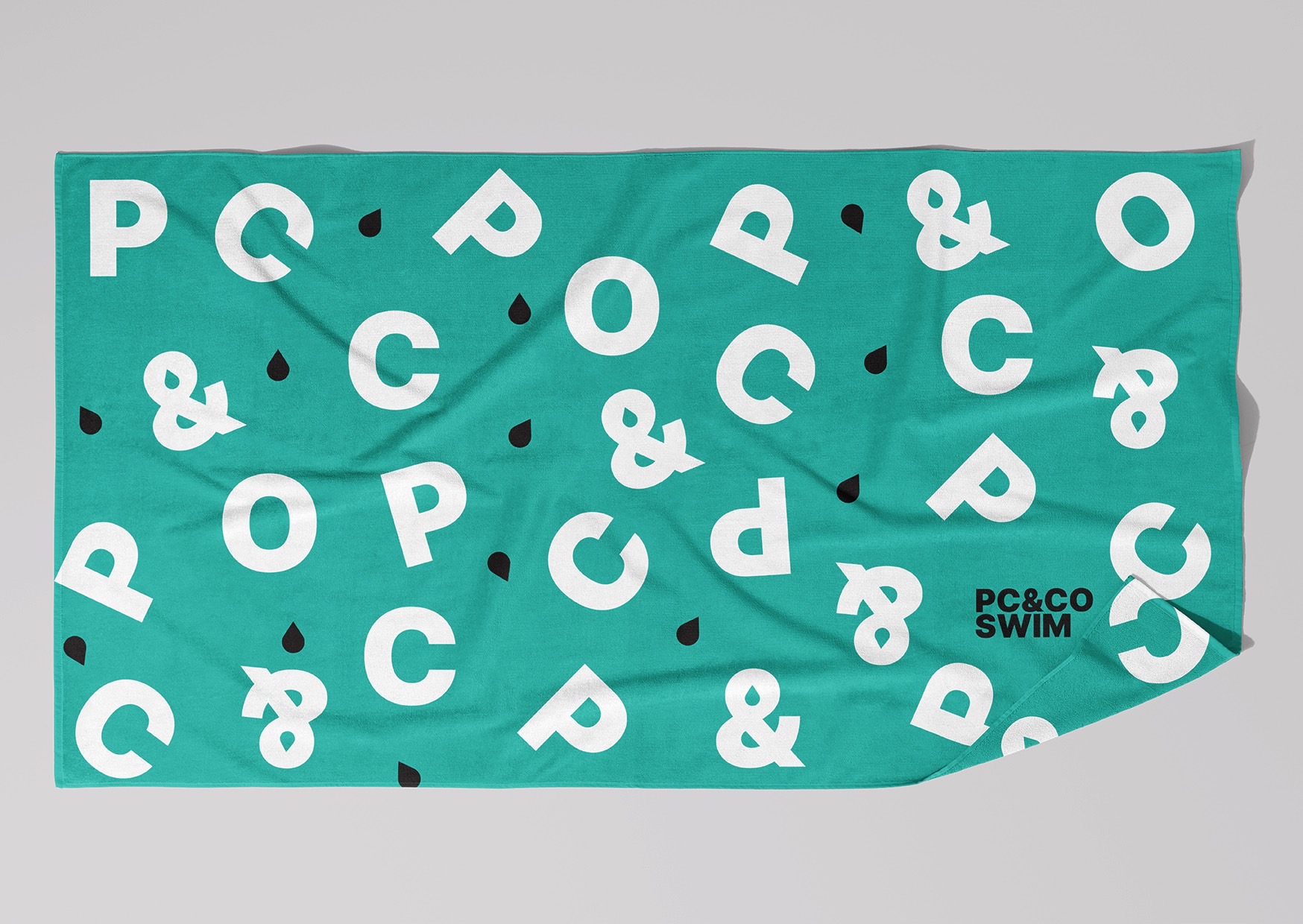
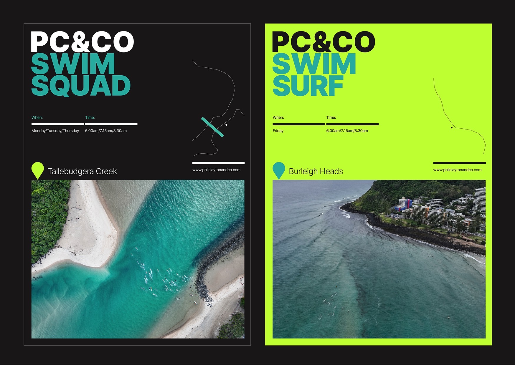
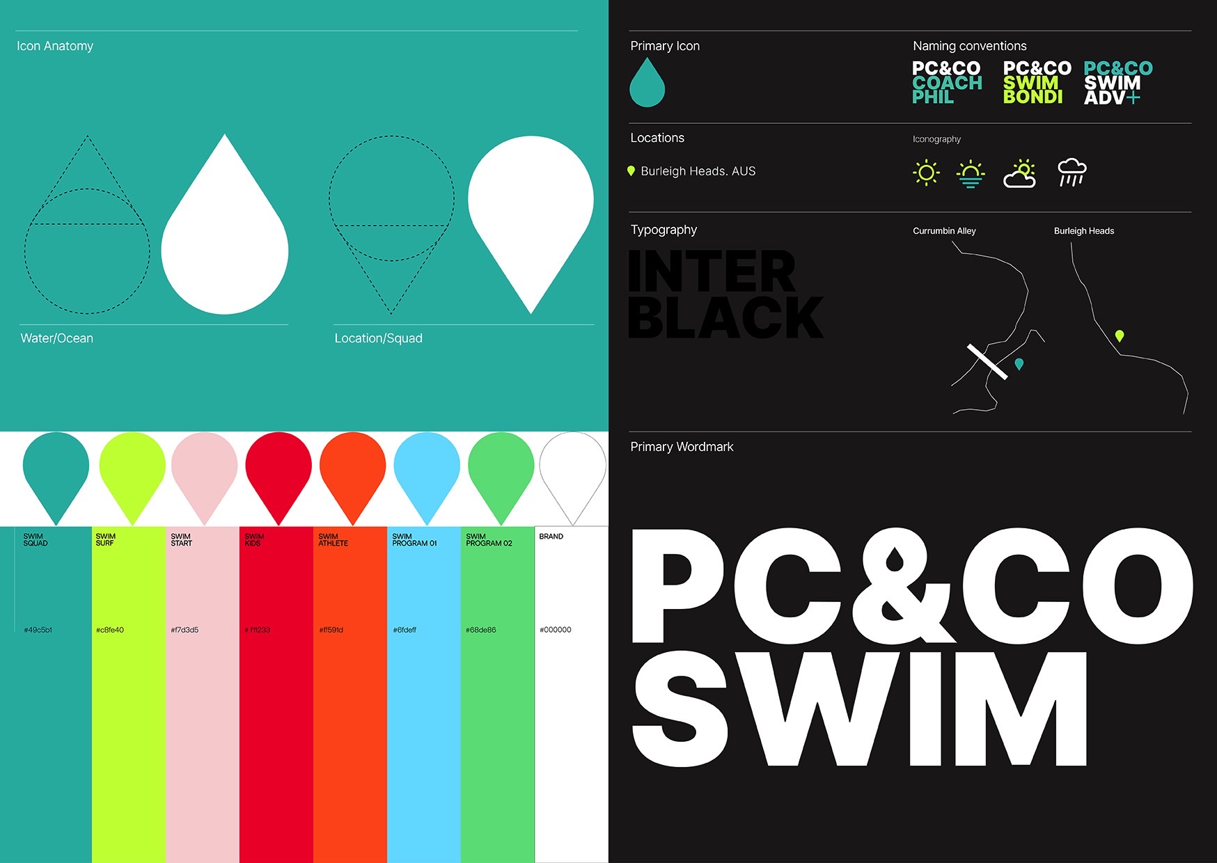
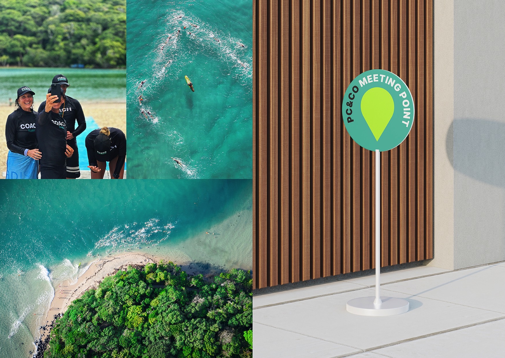
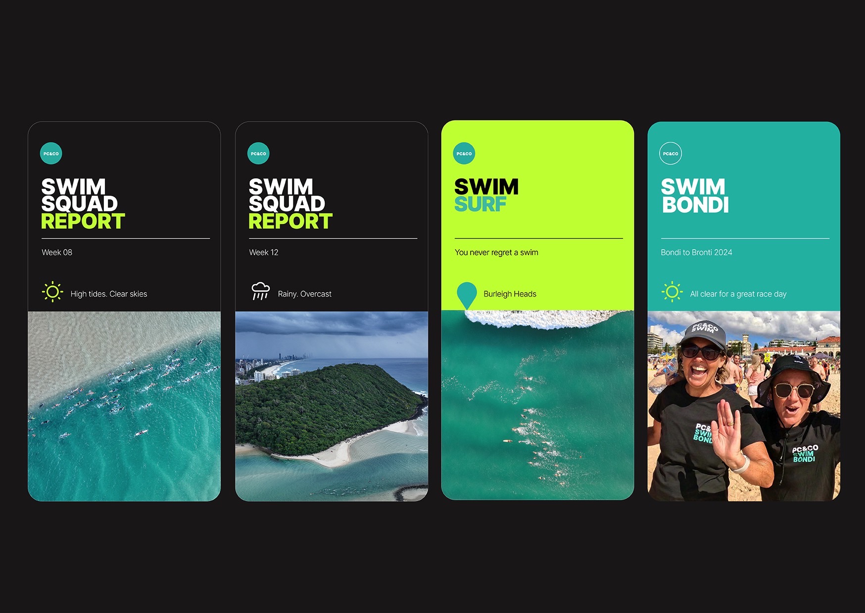
We built an identity centred around the ampersand, the water droplet and location icon. This represents, Community, Ocean, and Location through the “PC&” brand architecture. The Primary brand colour was inspired by the crystal teal waters of Burleigh, and the secondary colour inspired by the bright colours of surf sports. Areial photography, clear iconography, and simple service names and booking system build an identifiable brand that is seen weekly around the Burleigh and Tallebudgera swim community.
PC&CO. Ocean swimming for everyone.

