**Challenge**
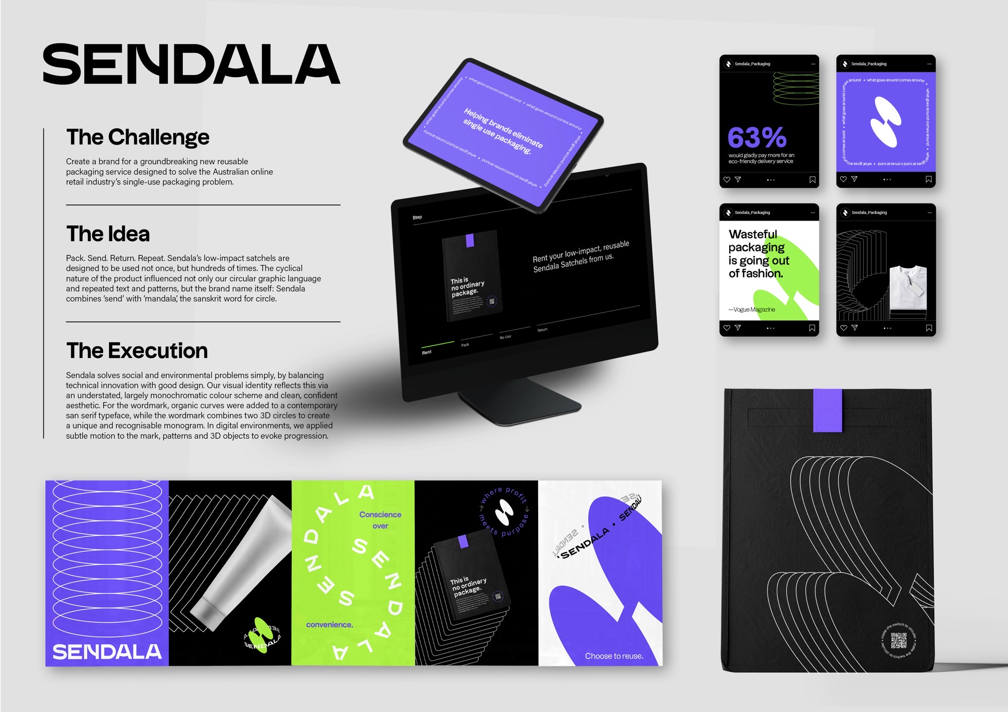
Create a brand for a groundbreaking new reusable packaging service designed to solve the Australian online retail industry’s single-use packaging problem.
**Idea**
Pack. Send. Return. Repeat. Sendala’s low-impact satchels are designed to be used not once, but hundreds of times. The cyclical nature of the product influenced not only our circular graphic language and repeated text and patterns, but the brand name itself: Sendala combines ‘send’ with ‘mandala’, the sanskrit word for circle.
Execution
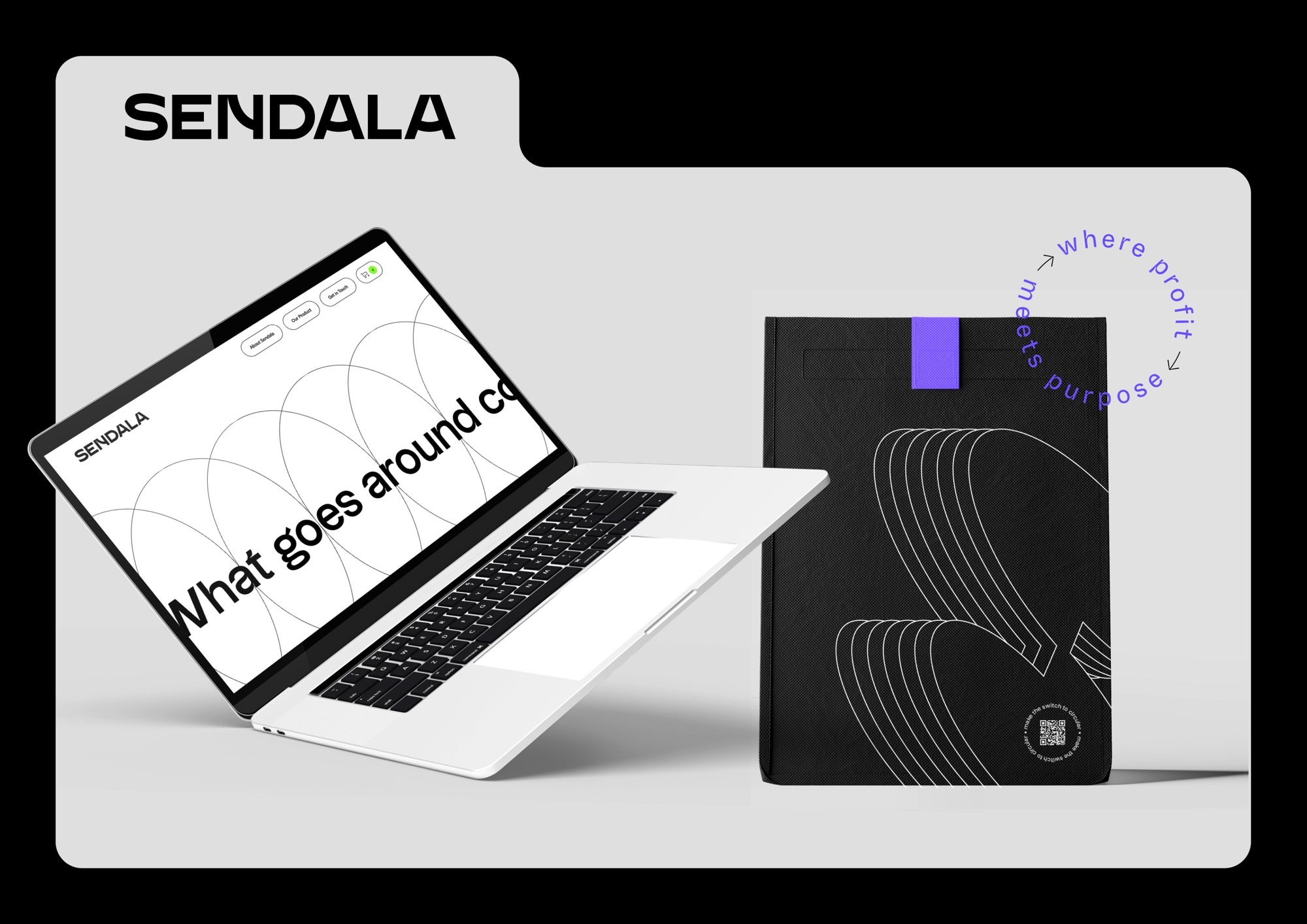
Sendala solves social and environmental problems simply, by balancing technical innovation with good design. Our visual identity reflects this via an understated, largely monochromatic colour scheme and clean, confident aesthetic. For the wordmark, organic curves were added to a contemporary san serif typeface, while the brandmark combines two 3D circles to create a unique and recognisable monogram. In digital environments, we applied subtle motion to the mark, patterns and 3D objects to evoke progression.
