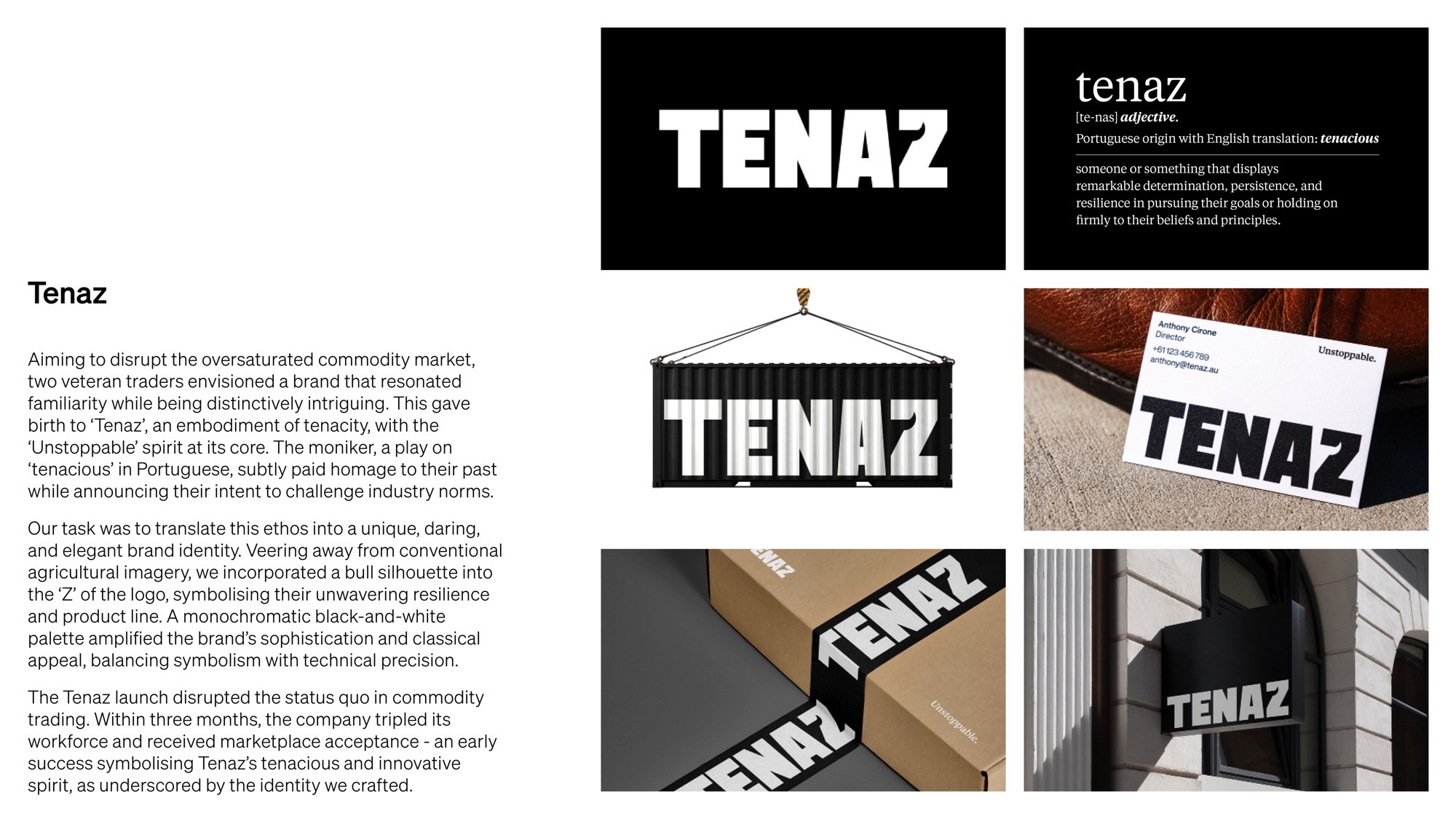
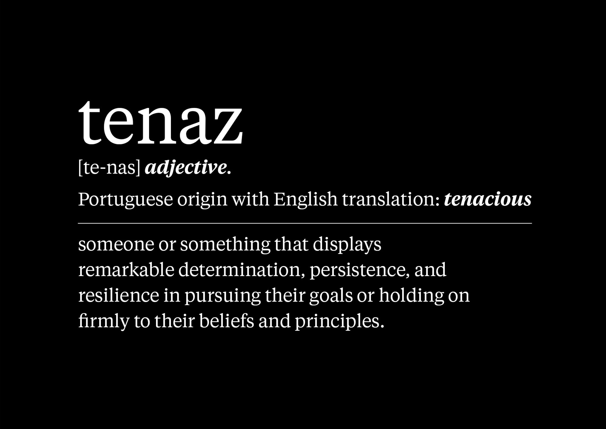
In the saturated commodity market, two seasoned traders launched ’Tenaz’, a brand epitomising tenacity and an ’Unstoppable’ spirit. The name, ’tenacious’ in Portuguese, subtly nods to their past while forecasting industry disruption.
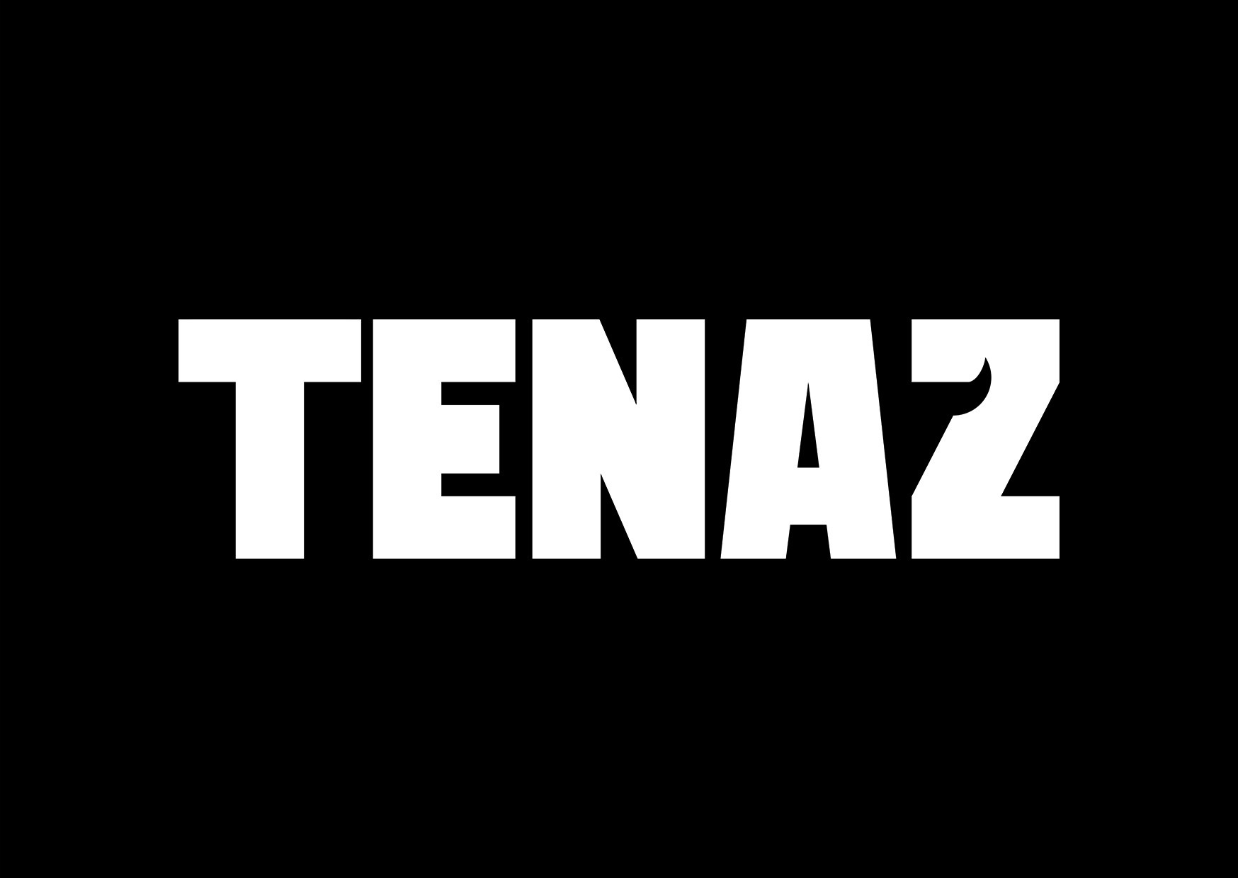
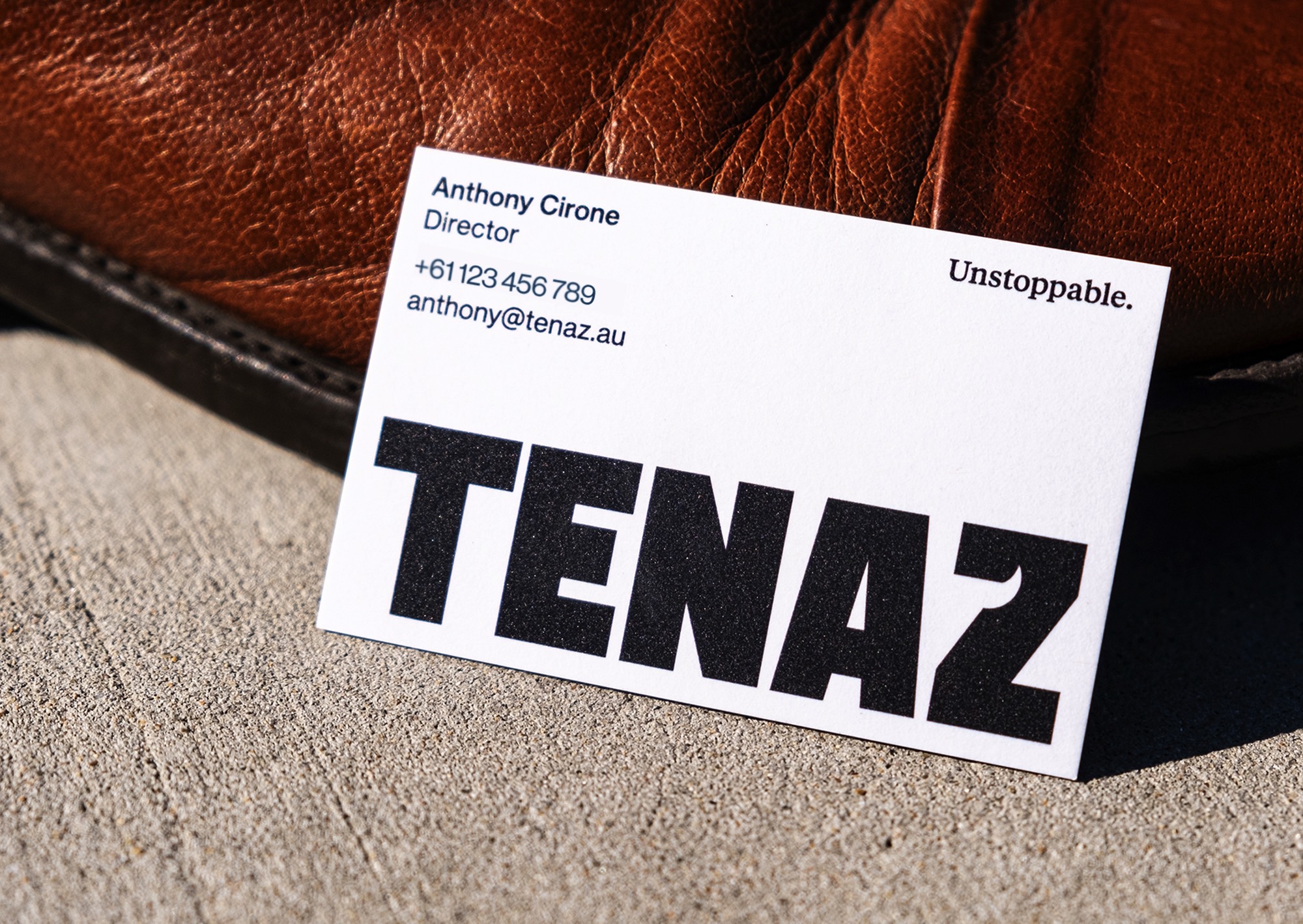
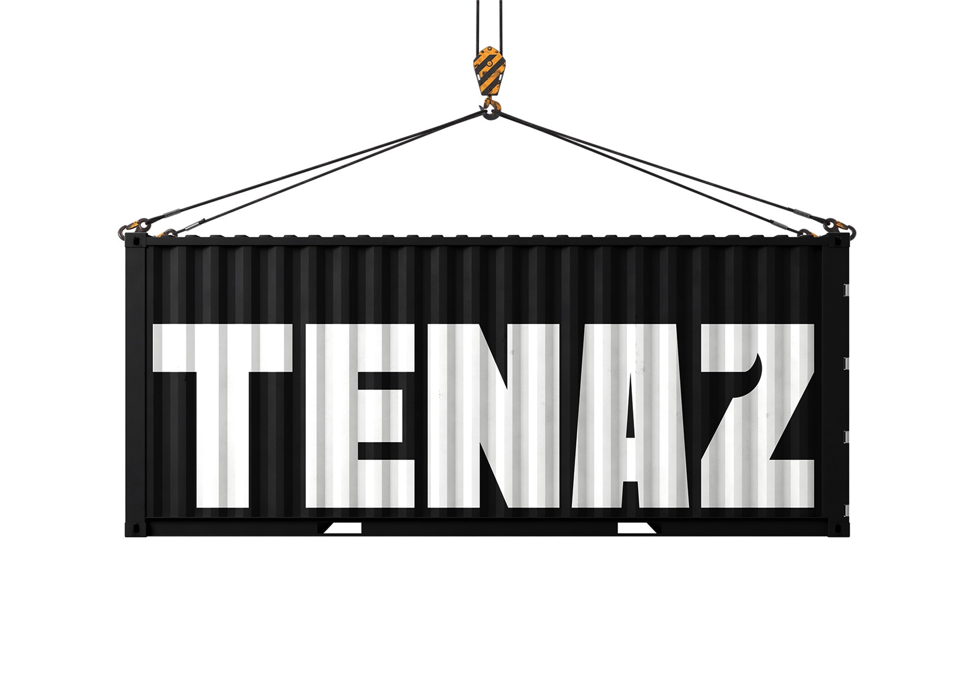
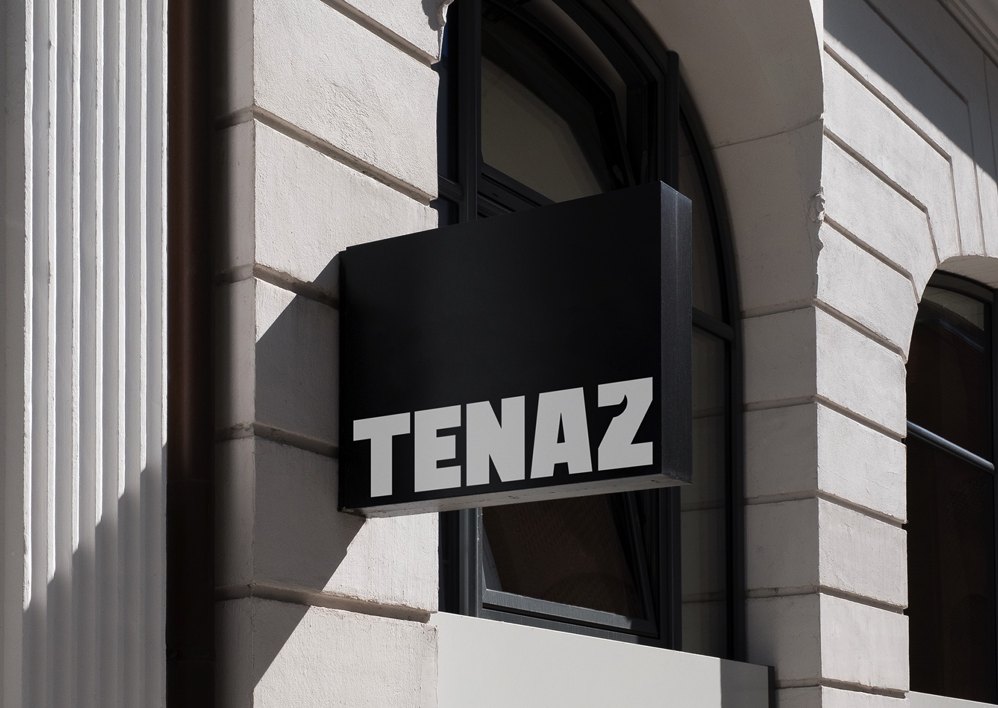
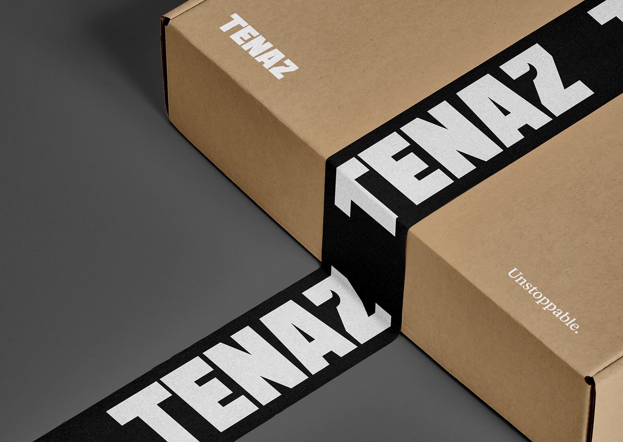
Our task: encapsulate this bold ethos into a distinctive, sophisticated logo. We innovatively integrated a bull silhouette into the ’Z’ of Tenaz, symbolising their resolve and diverse product line. A monochromatic palette enhanced the brand’s classical elegance, perfectly balancing symbolism and technical precision.
Inspired by Leonardo da Vinci’s mantra of simplicity equating sophistication, we subtly hinted at a bull in the ’Z’s negative space. We selected the robust ’Sledge’ typeface, its tight kerning reflecting the brand’s bold confidence and unwavering grit. The resulting wordmark is sophisticated, credible, and impactful – a testament to Tenaz’s tenacity and disruptive market entrance.
