Challenge
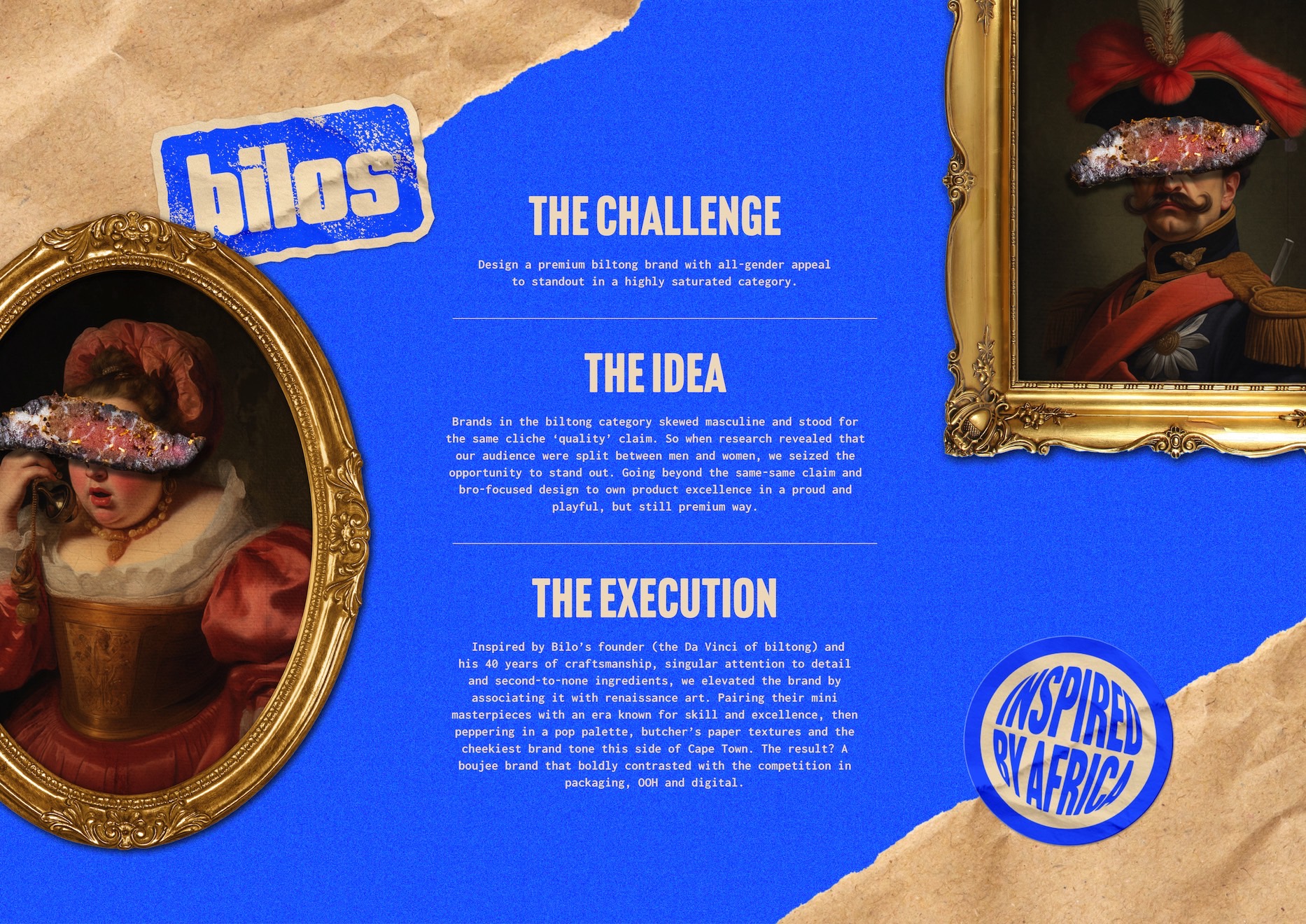
Design a premium biltong brand with all-gender appeal to standout in a highly saturated category.
Idea
Brands in the category skewed masculine and stood for the same cliched ‘quality’ claim. So when research revealed that our audience were split between men and women, we seized the opportunity to stand out, going beyond the same-same claim and bro-focused design to own product excellence in a proud, playful, but still premium way.
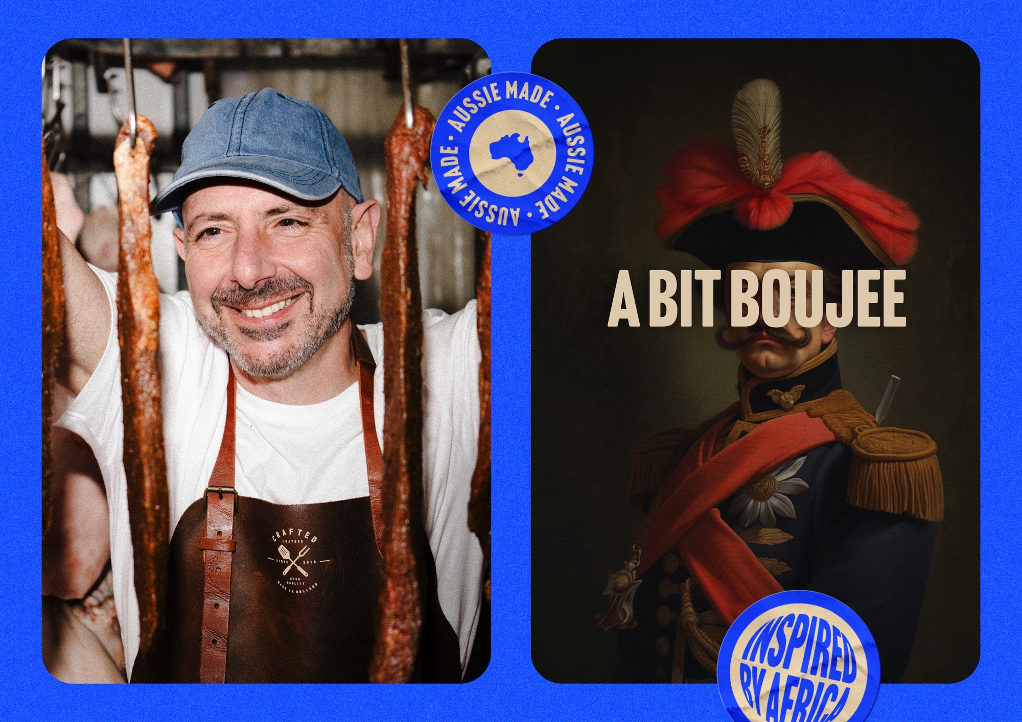
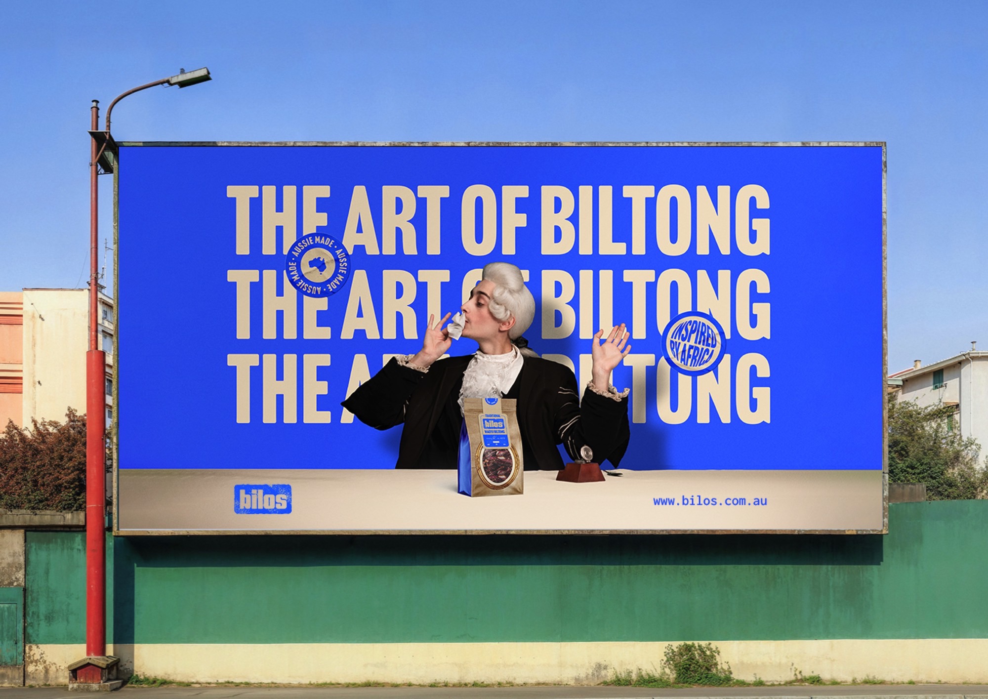
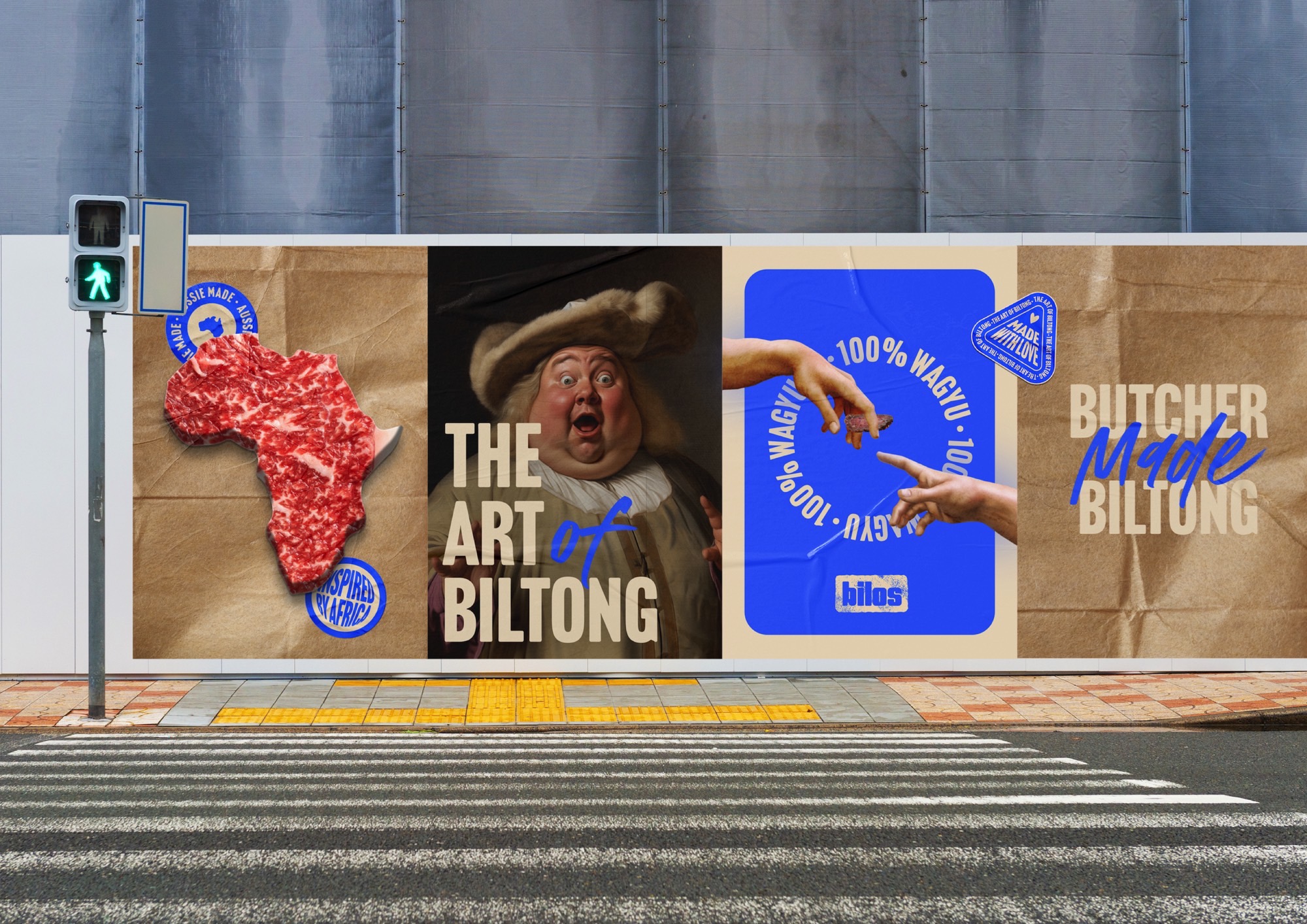
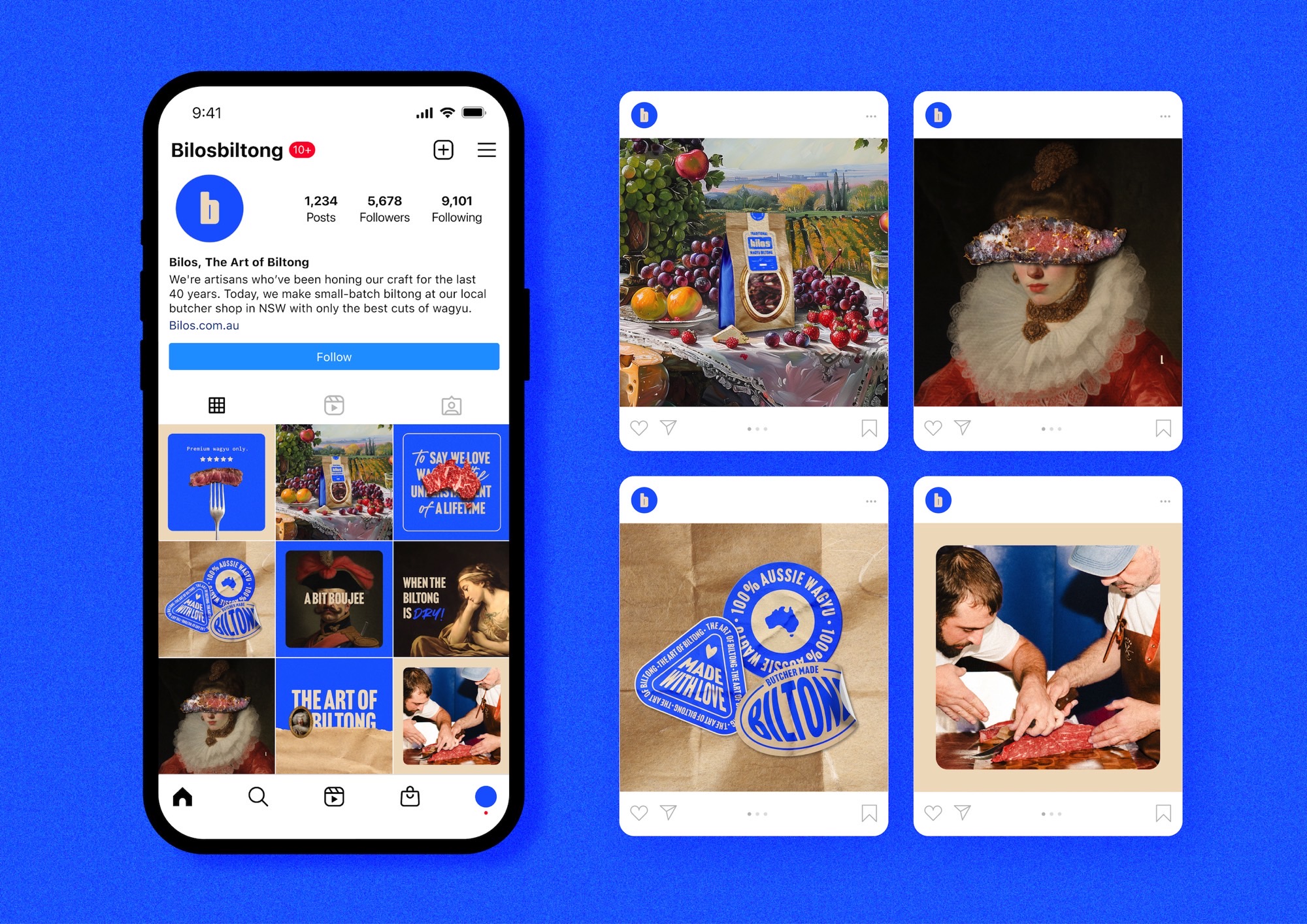
Execution Inspired by Bilo’s founder (the Da Vinci of biltong) and his 40 years of craftsmanship, singular attention to detail and second-to-none ingredients, we elevated the brand by associating it with renaissance art. Pairing their mini-masterpieces with an era known for skill and excellence, then peppering in a pop palette, butcher’s paper textures and the cheekiest brand tone this side of Cape Town. The result? A boujee brand that boldly contrasted with the competition in packaging, OOH and digital.
