
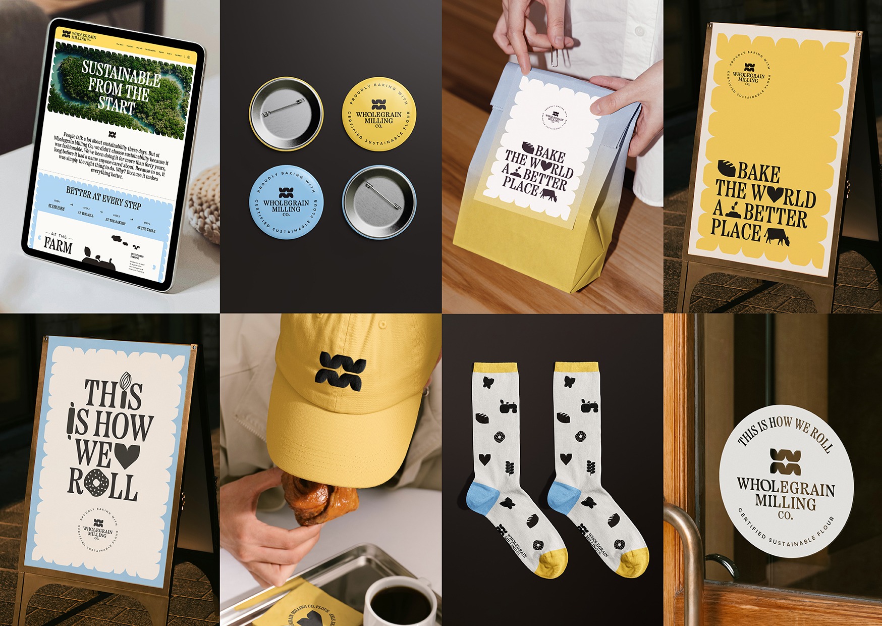
THE BRIEF: Wholegrain Milling Co. is not just a flour mill, it’s Australia’s leading producer of sustainable flour. Its old brand, however, no longer matched its scale or ambition. It needed a new logo to flex across packaging, trade tools, digital platforms and partner products — while carrying real meaning, not just decoration.THE IDEA: Every part of the new logomark tells the Wholegrain story. The ‘O’ in the wordmark is a grain shape that becomes a ‘W’ for Wholegrain, and flipped, an ‘M’ for Milling, its grooves echoing a millstone. THE EXECUTION: From that mark, we built a full family: a stacked primary logo, a horizontal secondary logo, and a small horizontal version for tight spaces like bread clips. The logomark flexes further — used alone as an icon, paired with the wordmark, or as a stacked, logomark or partner badge for bakers and retailers signalling sustainable flour use.
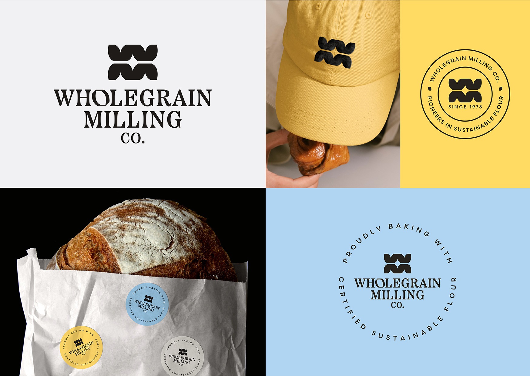
Wholegrain Milling Co. logo

