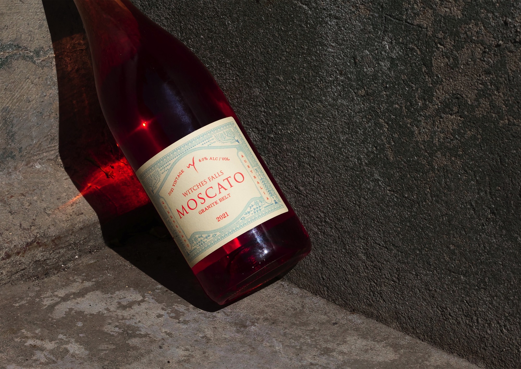
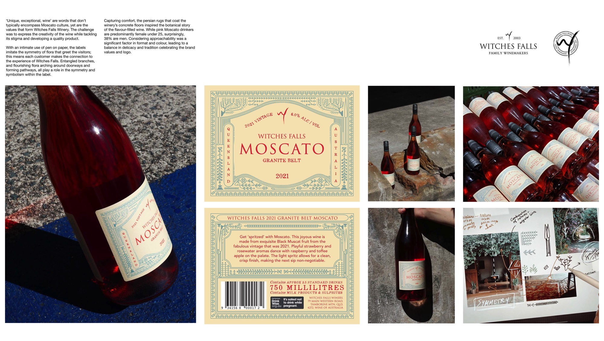
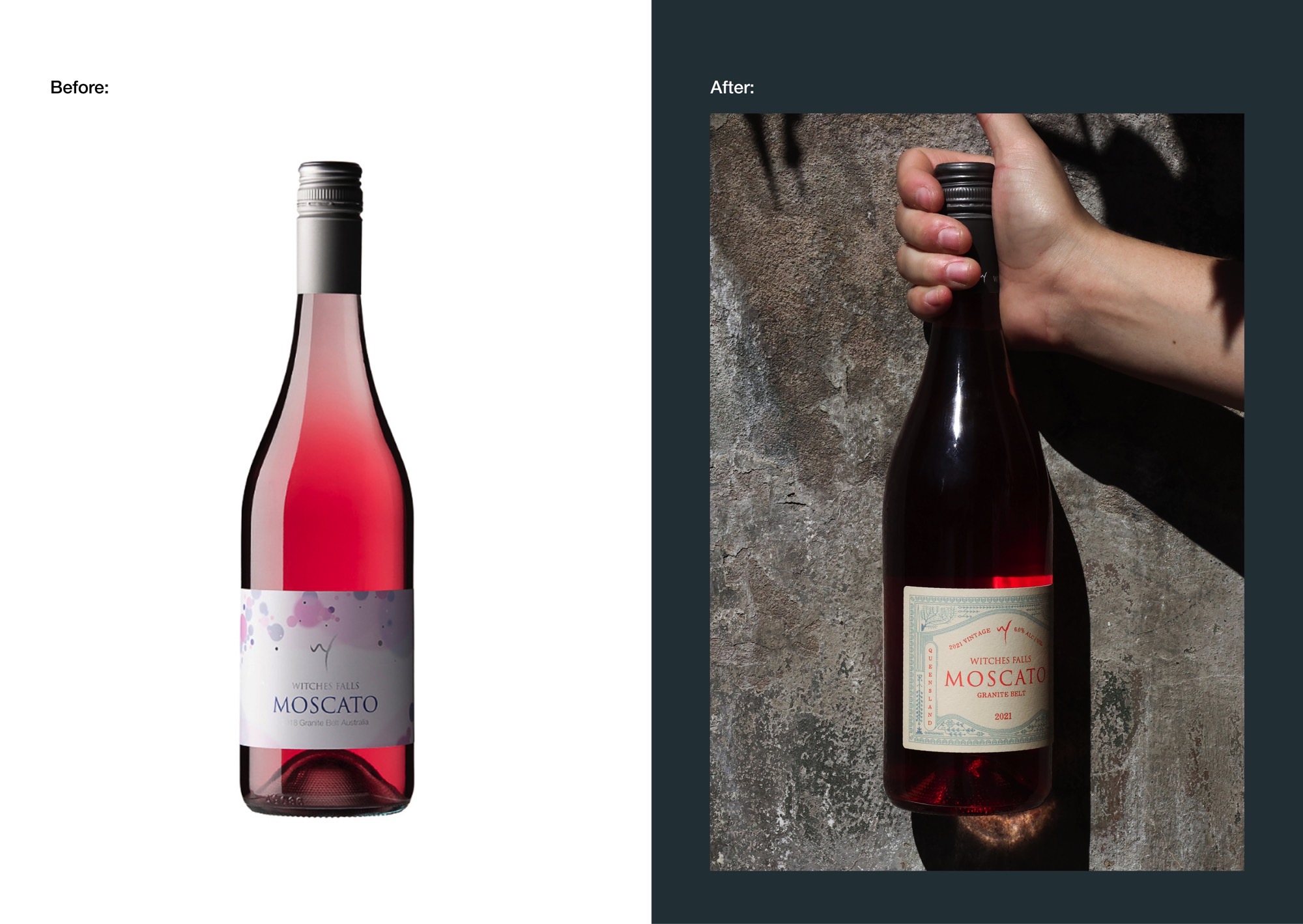
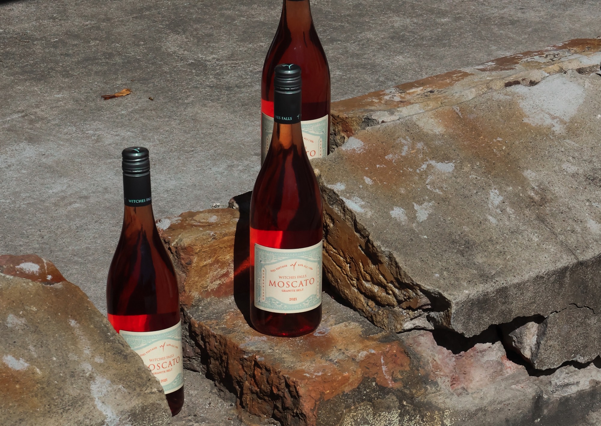
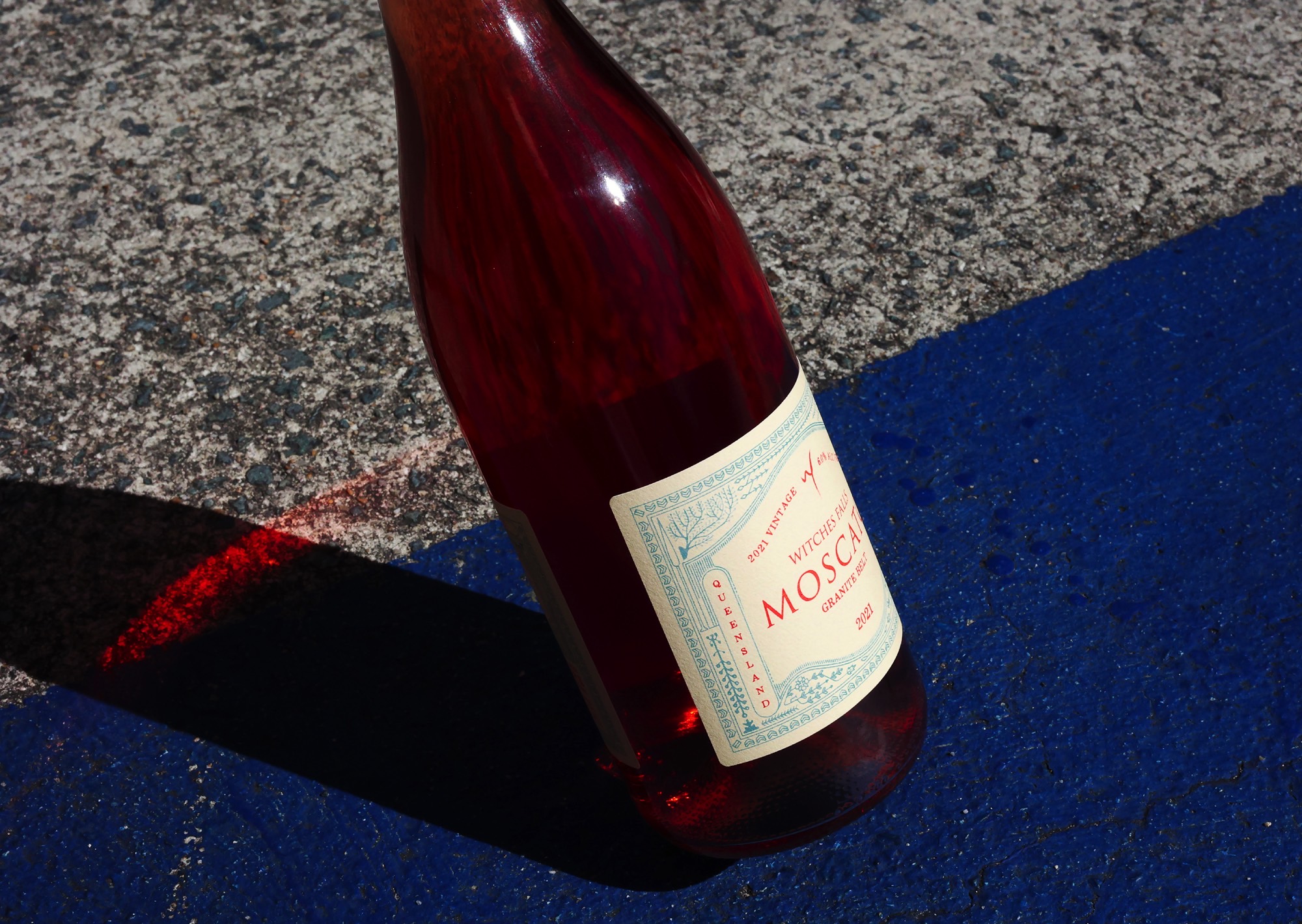
‘Unique, exceptional, wine’ are words that don’t typically encompass Moscato culture, yet are the values that form Witches Falls Winery. The challenge was to express the creativity of the wine while tackling its stigma and developing a quality product.
With an intimate use of pen on paper, the labels imitate the symmetry of flora that greet the visitors; this means each customer makes the connection to the experience of Witches Falls. Entangled branches, and flourishing flora arching around doorways and forming pathways, all play a role in the symmetry and symbolism within the label.
Capturing comfort, the persian rugs that coat the winery’s concrete floors inspired the botanical story of the flavour-filled wine. While pink Moscato drinkers are predominantly female under 25, surprisingly, 38% are men. Considering approachability was a significant factor in format and colour, leading to a balance in delicacy and tradition celebrating the brand values and logo.

