Brief
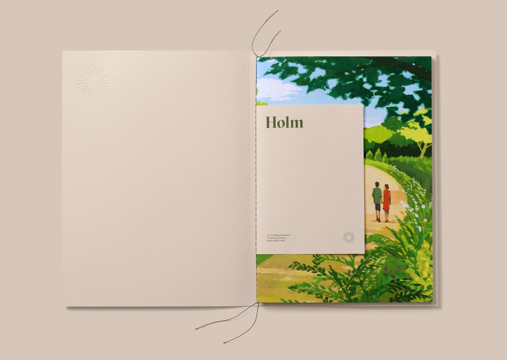
We were engaged by HG Developments to create am identity for a group of townhouses to be built on an old, oversized, slightly awkwardly sloping residential block surrounded by trees that looked down across Bardon and the city.
Idea
We often take inspiration from the location. A sloping block, a hill, elevation, views, trees, breezes. The Scandinavian word for ‘an island within a larger area’ is Holm. It’s also a homophone – so, it sounds like Home, but it’s much more visually interesting as a design.
Execution
Our Senior Designer Kevin Lam spoke to illustrator Makoto Funatsu and commissioned a series of images ‘of what it’s like to live in Bardon’. They gave us the opportunity to write lines like:
There’s no place like Holm, and, Holm is where the heart is.


